-
Notifications
You must be signed in to change notification settings - Fork 1
tatoolbar tabs & theming
gabdub edited this page Aug 2, 2021
·
6 revisions
Theming Features:
- It allows to have the same look and feel in different operating systems and to exactly match the colors used in the editor
- You can choose between different predefined themes or create your own (just copy one and edit it)
Tabs Features:
- 4 tab-states: normal, hilight on over, active and disabled
- the parts of the image that are not stretched (borders) can be set in the image file name (used in tabs and backgrounds) (for example: "ttb-button-active**__LRTB4**.png" has a 4 pixels border at the Left, Right, Top and Bottom)
- each tab-state can have a different text color
- tab show/hide control
- tab tooltip
- 3 width options: text length, fixed width and expanded (with optional minimum and maximum width)
- 3 options to show file modification: change text, show an image, change text color
- option to show a close button in every tab (with highlight on mouse over)
- option to close a tab with double click
- option to rearrange tabs by dragging
- can have buttons on both sides
- scroll bar buttons are shown when needed (mouse wheel can be used to scroll tabs)
- every toolbar can have one tab group (the status-bar is actually a tab group)
- font face, size and y-position adjustment
Some examples using tabs and themes:
theme: win10-light

theme: bar-sm-light

theme: bar-th-dark

theme: bar-ch-dark

theme: bar-sm-light variations

Two rows with tabs at the bottom and close button

Two rows with tabs at the top and some tweaks

theme: bar-th-dark variations

theme: bar-th-dark with a different background

mixed horizontal & vertical

see also:
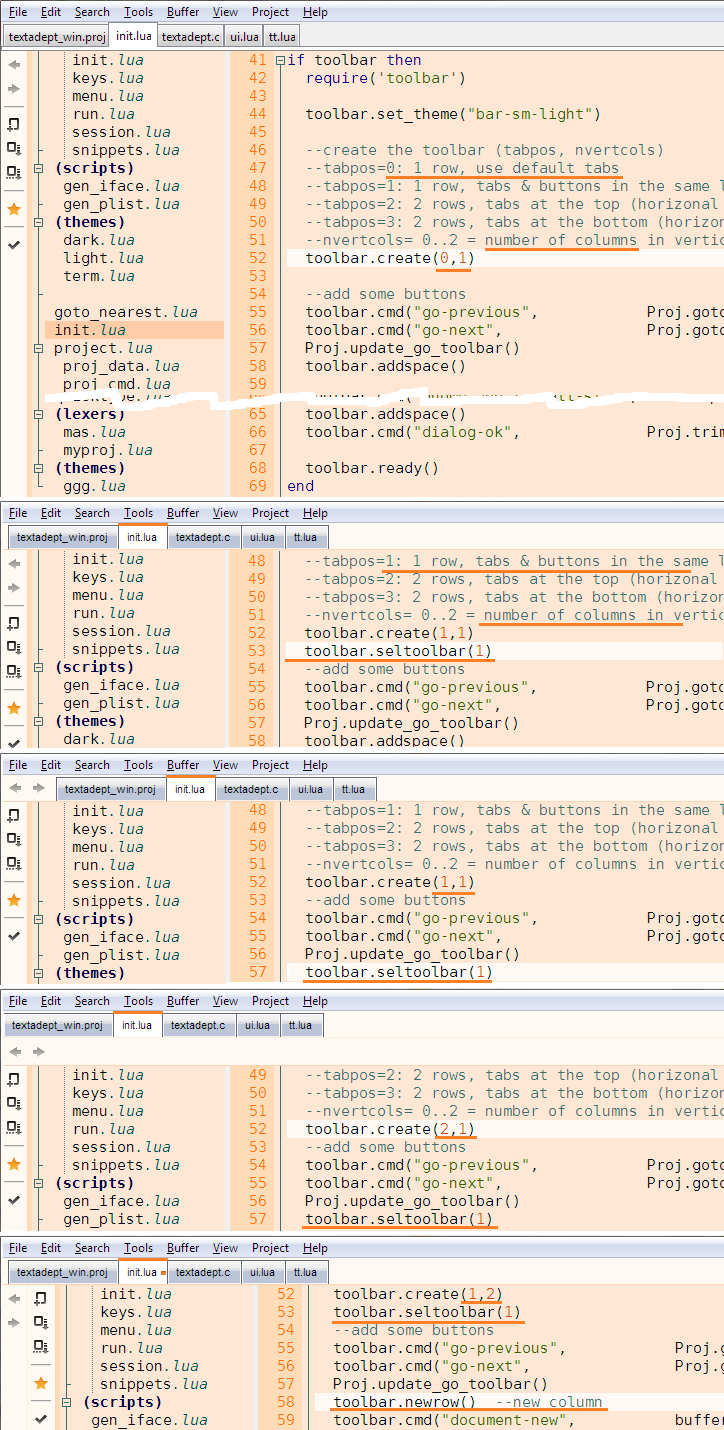
see toolbar code