feat(Menu): Add wrapper prop to MenuItem#323
Conversation
 miroslavstastny
requested review from
dvdzkwsk,
kuzhelov,
levithomason and
mnajdova
as code owners
miroslavstastny
requested review from
dvdzkwsk,
kuzhelov,
levithomason and
mnajdova
as code owners
Codecov Report
@@            Coverage Diff             @@
##           master     #323      +/-   ##
==========================================
- Coverage    88.4%   88.37%   -0.03%
==========================================
  Files          41       41
  Lines        1423     1428       +5
  Branches      181      207      +26
==========================================
+ Hits         1258     1262       +4
- Misses        161      162       +1
  Partials        4        4
Continue to review full report at Codecov.
|

|
share the same sentiments around benefits of the proposal (as well as about the problems it addresses), need to make couple of tests to verify it further. Speaking of the tests - this is the thing that is easily adjustable, as long as we will agree to update already taken principles :) But, once again, as it is relatively drastic change, it should be carefully tested before. Just for the sake of having a fair overview: in regards to impossibility of addressing ...={() => (Component, props) => (<li {...props} style={{border: '1px solid red'}}>{props.children}</li>)}}The same would apply to |
…nd handlesAccessibility, re-enabled MenuItem tests
 bmdalex
left a comment
bmdalex
left a comment
bmdalex
left a comment
There was a problem hiding this comment.
Great work @miroslavstastny
src/lib/factories.tsx
Outdated
| export const createHTMLInput = createShorthandFactory('input', val => ({ type: val })) | ||
| export const createHTMLLabel = createShorthandFactory('label', val => ({ children: val })) | ||
| export const createHTMLParagraph = createShorthandFactory('p', val => ({ children: val })) | ||
| export const createHTMLLi = createShorthandFactory('li', val => ({ children: val })) |
There was a problem hiding this comment.
createHTMLListItem would be more consistent with other factory names
|
One additional note - As discussed with @jurokapsiar offline, if this approach gets merged, we will review MenuItem behaviors and simplify them as a lot of their logic is no longer necessary after this change. |
src/components/Menu/MenuItem.tsx
Outdated
| ) | ||
|
|
||
| if (wrapper) { | ||
| return createHTMLListItem(wrapper, { |
There was a problem hiding this comment.
don't we want this to be an actual Slot shorthand so it's being passed through the Fella renderer? look for Slot.create references; we can discuss tomorrow
There was a problem hiding this comment.
To expand here, we need to pass the content of wrapper prop through the Fella renderer in order to leverage Fella's functionality (rtl, styles applied as classnames, etc)
The way to go now is by using Slot; I'm doing the same for Input in #326
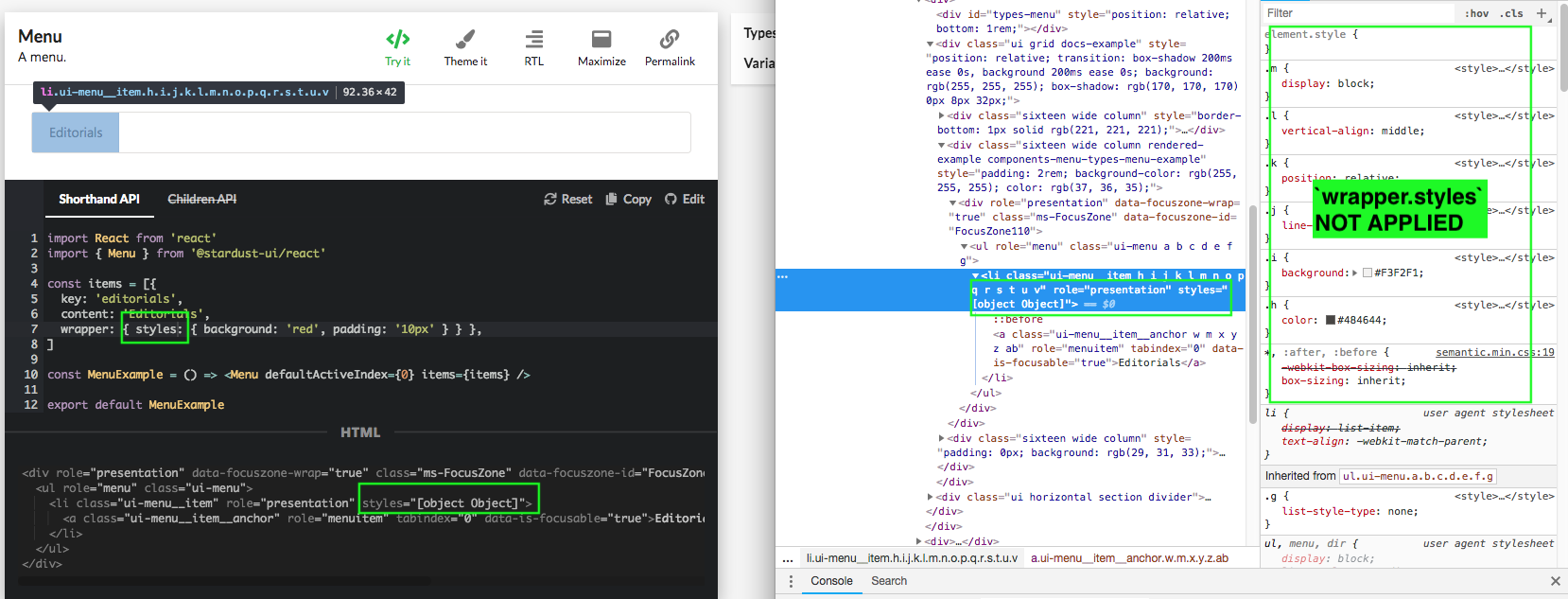
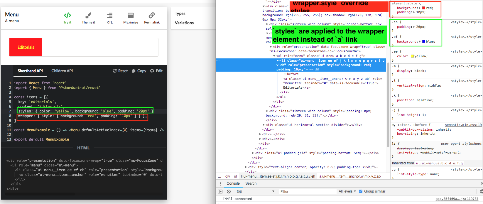
Right now we need to use wrapper.style instead of wrapper.styles to style the wrapper and these are applied directly to element.style and not through classnames:
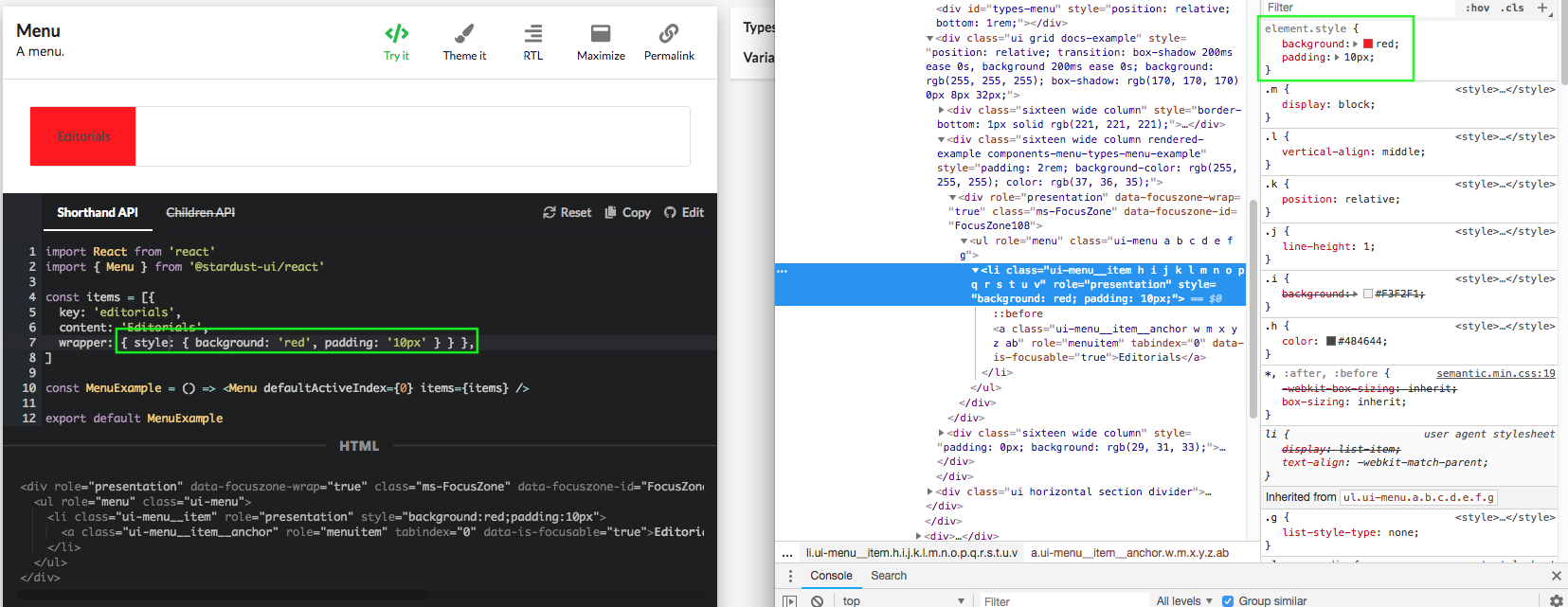
wrapper.styles won't work (it will be added directly to the DOM as an attribute), need to use Slot for that:
src/components/Menu/MenuItem.tsx
Outdated
| if (wrapper) { | ||
| return createHTMLListItem(wrapper, { | ||
| defaultProps: { | ||
| className: classes.root, |
There was a problem hiding this comment.
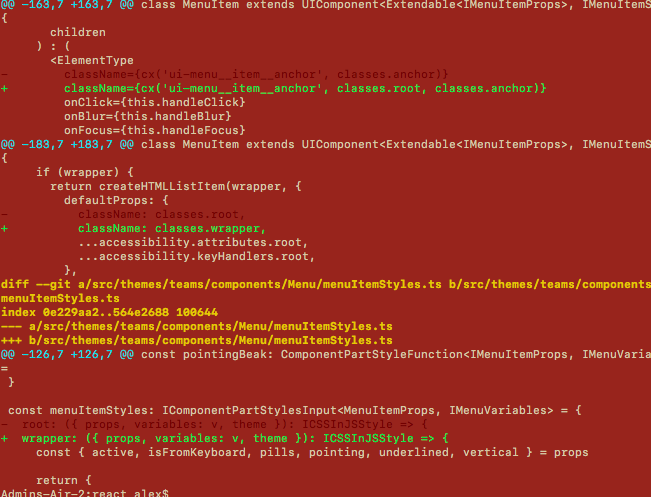
there are a few problems caused by this; when we pass custom styles prop at the MenuItem level, they will be applied to the li wrapper instead of the a link
It can be fixed by renaming the root slot to something like wrapper here and add classes.root to the a link; here are the changes:
and here is the expected result (contains the changes):
There was a problem hiding this comment.
problem is the tests will fail now..
There was a problem hiding this comment.
Good catch, thanks!
The main problem is that ui-menu__item class now goes to the a and nothing to the li.
Not sure if it would be ok to have ui-menu__item on the inner a and ui-menu-wrapper on the outer li.
Plus similar change should be done in behaviors.
I will look into that.
There was a problem hiding this comment.
well we can definitely rename ui-menu__item to ui-menu__item__link or something similar and use item instead of wrapper an name that ui-menu__item instead of ui-menu-wrapper
There was a problem hiding this comment.
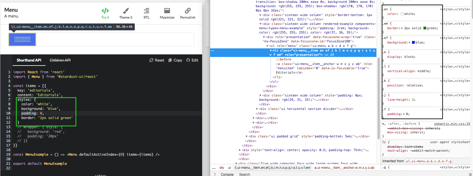
here is another example that shows that styles prop and wrapper.style are styling the same element, the wrapper and wrapper.style with the latter having higher priority since it's applied to the element style directly; currently we cannot target the a link to style it:
|
I've updated the PR as follows:
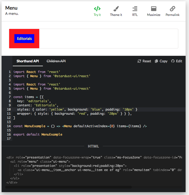
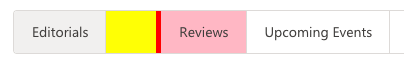
Example const items = [
...
{
key: 'review',
content: 'Reviews',
styles: { borderLeft: '5px solid red' },
style: { background: 'pink' },
className: 'CLASS-ANCHOR',
'data-custom': 'DATA-ANCHOR',
wrapper: {
styles: { paddingLeft: '50px' },
style: { background: 'yellow' },
className: 'CLASS-WRAPPER',
'data-custom': 'DATA-WRAPPER'
},
},
...
]Renders as: <li role="presentation"
style="background:yellow"
data-custom="DATA-WRAPPER"
class="ui-slot dy ui-menu__item__wrapper CLASS-WRAPPER">
<a class="ui-menu__item ea CLASS-ANCHOR"
role="menuitem"
tabindex="0"
data-is-focusable="true"
style="background:pink"
data-custom="DATA-ANCHOR">
Reviews
</a>
</li>
@Bugaa92 would you mind reviewing again? Thanks! |
bmdalex
left a comment
bmdalex
left a comment
There was a problem hiding this comment.
pls take a look at comments, thanks
|
|
||
| static defaultProps = { | ||
| as: 'li', | ||
| as: 'a', |
There was a problem hiding this comment.
when we discussed changes for Input component we had a consensus that as and styles props always go to the root element; we might want the same for MenuItem; let's see what others say @levithomason @kuzhelov
There was a problem hiding this comment.
IIRC there is an accessibility requirement that the click listener needs to be on the anchor tag. The primary use case for as on the menu item is to allow adding router functionality. This means the router's navigation handler needs to be applied to the anchor:
import { NavLink } from 'react-router'

<Menu items={[{ as: NavLink, to: '/', content: 'Home' }]} />
If the as prop goes to the root, it will still work as the event will bubble from the anchor up to the li, however, it would not be the correct markup and behavior for the accessibility requirement.
| children | ||
| ) : ( | ||
| <ElementType | ||
| className={classes.root} |
There was a problem hiding this comment.
when we discussed changes for Input component we had a consensus that styles prop always goes to the root element; we might want the same for MenuItem; this will break that convention when wrapper prop is defined; let's see what others say @levithomason @kuzhelov
src/lib/factories.tsx
Outdated
| export const createHTMLInput = createShorthandFactory('input', val => ({ type: val })) | ||
| export const createHTMLLabel = createShorthandFactory('label', val => ({ children: val })) | ||
| export const createHTMLParagraph = createShorthandFactory('p', val => ({ children: val })) | ||
| export const createHTMLListItem = createShorthandFactory('li', val => ({ children: val })) |
There was a problem hiding this comment.
no need to add this as we're removing HTML factories in #376
src/components/Slot/Slot.tsx
Outdated
|
|
||
| static create = createSlotFactory(Slot.defaultProps.as, content => ({ content })) | ||
| static createHTMLInput = createSlotFactory('input', type => ({ type })) | ||
| static createHTMLListItem = createSlotFactory('li', children => ({ children })) |
There was a problem hiding this comment.
no need to add this as we're removing HTML factories in #376
use createSlotFactory('li', children => ({ children })) directly where you need it
src/components/Menu/MenuItem.tsx
Outdated
| ) | ||
|
|
||
| if (wrapper) { | ||
| return Slot.createHTMLListItem(wrapper, { |
There was a problem hiding this comment.
this was discussed in previous sync meetings; pls use createSlotFactory('li', children => ({ children })) directly; see comments in Slot.tsx
| } | ||
| } | ||
|
|
||
| if (usesWrapperSlot) { |
There was a problem hiding this comment.
@kuzhelov @levithomason
I think we should avoid changing isConformant tests for the elements with wrapper slot; we had this discussion for Input component.
@miroslavstastny AFAIR, the tests that fail are related to as and className props not being set correctly; these can be solved by addressing the comments I had in MenuItem.tsx where as and styles should always be passed to the root element, being that the a or the li for the MenuItem case.
This probably requires a session where we can discuss options in more detail; @miroslavstastny feel free to schedule a meeting with me and @kuzhelov
There was a problem hiding this comment.
Thank you very much for the review, @Bugaa92.
So the main question is whether we should split props between li and a as we do in Input or pass everything to the a.
I am not strictly against doing the split, but when I was considering this I thought it would make more sense to do 'everything to a' although it is different approach than in Input.
We should consider usability and API consistency first and test after that.
Agree to discuss this offline.
There was a problem hiding this comment.
thanks for sharing your thoughts, @miroslavstastny, @Bugaa92
So the main question is whether we should split props between li and a as we do in Input or pass everything to the a.
If I would answer this question only for the MenuItem component I would rather choose to not split and apply all the props to wrapped <a> element. This would make the following usage case be quite more apparent to me as a user, given that I am aware of wrapper concept
<MenuItem styles={..} href={..} />It would be really confusing and non-intuitive to me if href will be applied to <a> element, while, at the same time, styles would be applied to <li>. In this situation I would rather expect consistent behavior, i.e. both props being applied to <a>.
At the same time, agree with the @Bugaa92's reasons for the concerns he has expressed, although see Input's situation to be a bit different: while for the menu's case it is a web standard that declares li to be a wrapper, in contrast, for the Input component's case it is a Stardust's need to use wrapper div (what is more interesting, this one is necessary for styling aspects, a bit smelly fact to me).
Agree to strive for consistent and intuitive API, and for this sake, let's, please, schedule a meeting as you've proposed - I will be back staring from 7th of November, but let me know if it should be decided earlier, will do all my best to allocate time for that.
Thank you!
| }, | ||
| render: renderWrapper, | ||
| overrideProps: () => ({ | ||
| children: menuItemInner, |
There was a problem hiding this comment.
very nice usage of overrideProps for children in the wrapper; basically we achieve not allowing the user to override children through wrapper prop 👍
I'll create a PR to do the same for Input component
There was a problem hiding this comment.
In this case we can use overrideProps as object
6 participants
Previous approach (MenuItemLink)
This is an alternative proposal to #283.
The original proposal splits
MenuItem(ElementType > a=li > a) toMenuItem(li) andMenuItemLink(a).That gives us a lot of flexibility, but makes Menu API more difficult:
{ content: {content: 'github.com', href:'https://github.com'}}{ content: {icon: 'call'}, icon: 'home' }a(but then it is not possible to specify the attribute forli)That approach also adds additional React component to the tree.
MenuItemwrapperslotThis PR keeps
MenuItemas a single element but renders it aswrapper > ElementTypeThat means that the
ais now the 'main element'Wrapper benefits
Considering
ul > li > amenu structure, users would need to customise theamore often thanli. This proposal makes customisations toastraightforward while keeping customisations to thelipossible.MenuItemLink vs Wrapper comparison
{content: 'Home' }{content: 'Home' }{content: {content: 'Home'}, icon: 'home' }{content: {content: 'Home', icon: 'home'}}{ content: 'Home', icon: 'home'}{ content: {content: 'github.com', href:'https://github.com'}}{ content: 'github.com', href:'https://github.com'}asfor inner{ content: {as: Button, content:'Home'}}{as: Button, content:'Home'}asfor outer{as: 'div', content:'Home'}{content: 'Home', wrapper: <div/>}{content: 'Home', renderWrapper: (Component, props) => (<Component {...props} style={{border: '1px solid red'}} />)}{content: 'Home', wrapper: <React.Fragment/>}rolefor outer{ content: 'Home', wrapper: {role: 'custom-role'} }Tests
Both
isConformantandhandlesAccessibilitynow support components with wrapper slot usingusesWrapperSlotconfig.