Professional K-Line (Candlestick) Chart Library for React Native
Ultra-smooth rendering • Interactive drawing tools • Multiple technical indicators • Dark/Light themes
English | 中文文档
React Native KLine View is a high-performance, feature-rich candlestick chart component designed for professional trading applications. Built with native optimization for both iOS and Android, it delivers smooth 60fps scrolling, zooming, and real-time data updates.
Perfect for cryptocurrency exchanges, stock trading apps, financial dashboards, and any application requiring professional-grade market data visualization.
- ✅ Ultra-smooth scrolling with native performance optimization
- ✅ Pinch-to-zoom with fluid gesture recognition
- ✅ Long-press details with animated info panels
- ✅ Real-time updates with efficient data management
- ✅ Multiple timeframes (1m, 5m, 15m, 30m, 1h, 4h, 1d, 1w)
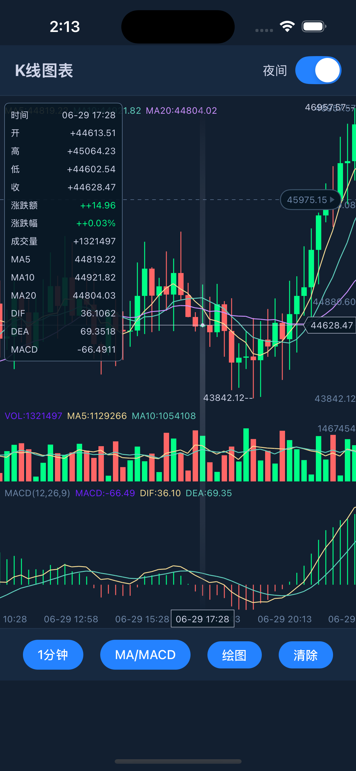
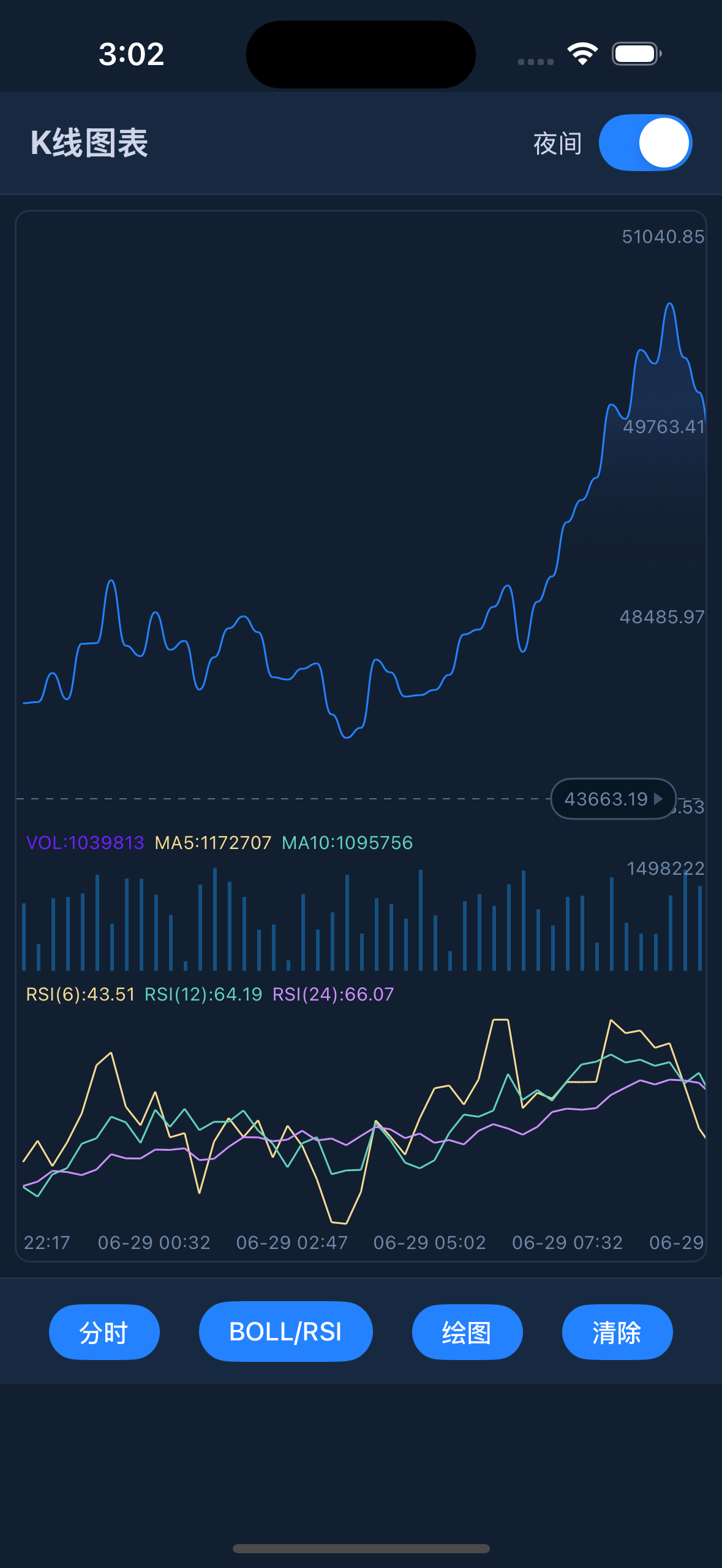
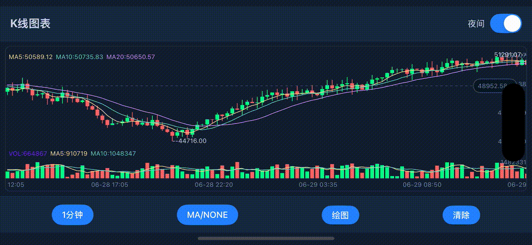
- ✅ Main Chart Indicators: MA, EMA, BOLL, SUPER (Supertrend)
- ✅ Sub Chart Indicators: MACD, KDJ, RSI, WR
- ✅ Customizable parameters for all indicators
- ✅ Multi-color indicator lines with smooth animations
- ✅ Volume analysis with dedicated volume chart
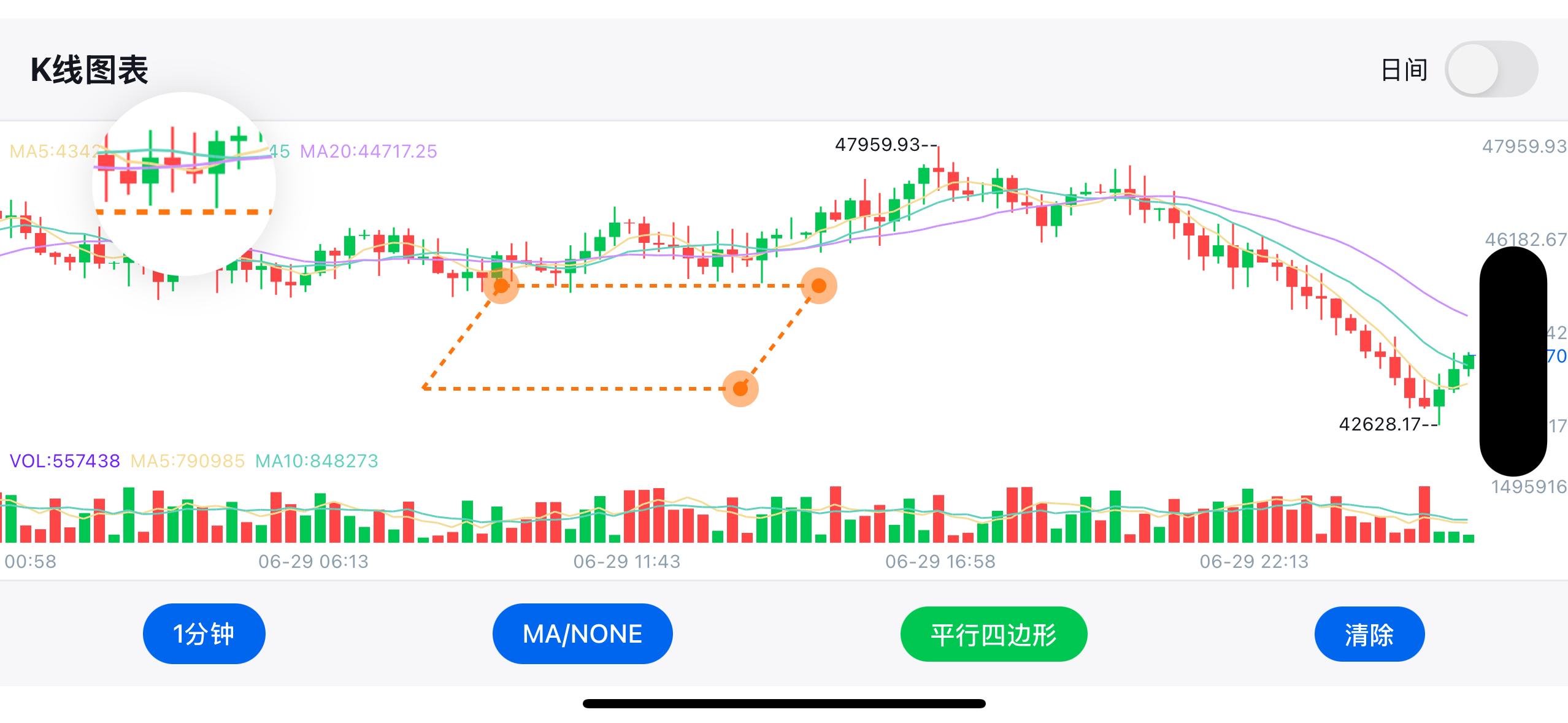
- ✅ Trend Lines - Diagonal support/resistance analysis
- ✅ Horizontal Lines - Price level marking
- ✅ Vertical Lines - Time-based event marking
- ✅ Rectangles - Range highlighting
- ✅ Text Annotations - Custom labels and notes
- ✅ Drawing persistence with touch-to-edit functionality
- ✅ Dark/Light themes with instant switching
- ✅ Gradient backgrounds for enhanced visual appeal
- ✅ Customizable colors for all chart elements
- ✅ Responsive design supporting both portrait and landscape
- ✅ High-DPI support for crisp rendering on all devices
- ✅ iOS & Android with platform-specific optimizations
- ✅ React Native New Architecture compatible
- ✅ Fabric renderer support for enhanced performance
- ✅ TypeScript definitions included
Smooth scrolling, zooming, and drawing operations at 60fps
npm install react-native-kline-view
# or
yarn add react-native-kline-view
# or
pnpm add react-native-kline-viewcd ios && pod installNo additional setup required for Android.
- iOS consumers must run
pod installafter adding/updating the package. - Android consumers do not need extra setup for autolinking.
- This package ships library files only. Demo app sources live in the GitHub repository.
For a comprehensive implementation with all features, see example/screens/KLineScreen.tsx.
You can now pass only candles (without manually building optionList JSON):
import RNKLineView, { type Candle } from "react-native-kline-view";

const candles: Candle[] = [
  {
    id: 1710000000000,
    dateString: "2024-03-09 10:00",
    open: 100,
    high: 110,
    low: 98,
    close: 108,
    vol: 1200,
  },
];

<RNKLineView style={{ flex: 1 }} candles={candles} />;You can now configure chart behavior with typed props directly:
<RNKLineView
  style={{ flex: 1 }}
  candles={candles}
  indicator={{
    primary: 1, // MA
    second: 3, // MACD
    time: 1,
    price: 2,
    volume: 3,
    targetList: {
      maList: [
        { title: "5", selected: true, index: 0 },
        { title: "10", selected: true, index: 1 },
        { title: "20", selected: true, index: 2 },
      ],
    },
  }}
  draw={{
    drawType: 0,
    drawColor: 0xff2563eb,
  }}
  theme={{
    colorList: {
      increaseColor: 0xff16a34a,
      decreaseColor: 0xffef4444,
    },
  }}
/>
If you need a rare/legacy key, use advanced as override:
<RNKLineView candles={candles} advanced={{ configList: { rightOffsetCandles: 2 } }} />Note: The example has been migrated to TypeScript, so
example/App.jsis no longer the main reference.
The example app demonstrates:
- 🎛️ Complete UI Controls - Time period selector, indicator switcher, drawing tools
- 🎨 Theme Management - Dark/Light mode with smooth transitions
- 📊 Indicator Management - Dynamic indicator switching and configuration
- ✏️ Drawing Tools - Full-featured drawing interface with tool selection
- 📱 Responsive Design - Adapts to different screen sizes and orientations
- Home screens guide:
docs/HOME_SCREENS.md - Main demo screen:
example/screens/KLineScreen.tsx - Entry point (if you added/kept it):
example/App.tsxshould renderKLineScreen
If you fork/customize this library, keep the example updated first — it doubles as the best integration test.
| Property | Type | Required | Default | Description |
|---|---|---|---|---|
optionList |
string | ✅* | - | JSON string containing all chart configuration and data |
candles |
Candle[] | ✅* | - | Simplified input. Required when optionList is omitted |
theme |
object | ❌ | - | Theme/color overrides for configList |
layout |
object | ❌ | - | Layout/size overrides for configList |
indicator |
object | ❌ | - | Main/sub indicator, precision and targetList |
draw |
object | ❌ | - | Drawing state (drawType, drawColor, clear/fix...) |
prediction |
object | ❌ | - | Prediction overlays (predictionList, entry/SL/TP...) |
interaction |
object | ❌ | - | Interaction flags (e.g. shouldScrollToEnd) |
format |
object | ❌ | - | Root precision/time fields (price, volume, time) |
advanced |
object | ❌ | - | Partial raw option override for uncommon legacy fields |
onDrawItemDidTouch |
function | ❌ | - | Callback when a drawing item is touched |
onDrawItemComplete |
function | ❌ | - | Callback when a drawing item is completed |
onDrawPointComplete |
function | ❌ | - | Callback when drawing point is completed |
* Requirement rule: pass either optionList or candles. If both are passed, optionList takes priority.
| Legacy key | New prop path |
|---|---|
modelArray |
candles |
targetList |
indicator.targetList |
primary, second |
indicator.primary, indicator.second |
price, volume, time |
format (or indicator) |
configList.*Color* |
theme |
configList layout fields |
layout |
drawList |
draw |
prediction* |
prediction |
shouldScrollToEnd |
interaction.shouldScrollToEnd |
For keys without a dedicated prop, use advanced.
| Callback | Parameters | Description |
|---|---|---|
onDrawItemDidTouch |
{ shouldReloadDrawItemIndex, drawColor, drawLineHeight, drawDashWidth, drawDashSpace, drawIsLock } |
Triggered when user touches an existing drawing item. Returns drawing properties for editing |
onDrawItemComplete |
{} |
Triggered when user completes creating a new drawing item |
onDrawPointComplete |
{ pointCount } |
Triggered when user completes adding points to a drawing (useful for multi-point drawings) |
If you stream real-time candles, you usually don't want to rebuild the whole optionList JSON on every tick.
This library exposes an imperative API through ref:
setData(candles: Candle[])→ reset/replace the entire datasetappendCandle(candle: Candle)→ append 1 candle to the endupdateLastCandle(candle: Candle)→ replace the last candle (or append if empty)
import React, { useRef } from "react";
import RNKLineView, {
  type Candle,
  type RNKLineViewRef,
} from "react-native-kline-view";

const klineRef = useRef<RNKLineViewRef>(null);

// reset all
klineRef.current?.setData(candles);

// realtime: a brand-new candle
klineRef.current?.appendCandle(nextCandle);

// realtime: update the candle currently forming
klineRef.current?.updateLastCandle(updatedLastCandle);
With props-first (initialData + mainIndicators/subCharts/volume), you only need to pass base OHLCV candles.
MA/EMA/BOLL/MACD/KDJ/RSI/WR are computed by the library when indicator.autoCompute !== false.
You can also mix server/client-computed values:
- pass partial
maList/rsiList/wrList/maVolumeListon candles when available - library keeps provided numeric values and computes only missing items/values
When using subIndicators.macd.style = "line_labels", you can customize right-tag labels:
subIndicators={{
  macd: {
    enabled: true,
    macdOnly: true,
    style: "line_labels",
    lineLabels: {
      macd: "MACD",
      signal: "Signal",
      histogram: "", // empty -> value only, no prefix
    },
  },
}}
Defaults are backward-compatible: MACD / Signal / Histogram.
No. If you've already called appendCandle(...), the native dataset is updated.
Only call setData(...) when you want to fully resync/reset (e.g. you changed timeframe, edited historical candles, or detected drift).
The optionList is a JSON string containing all chart configuration. Here's the complete structure:
| Property | Type | Default | Description |
|---|---|---|---|
modelArray |
Array | [] |
K-line data array (see Data Format below) |
shouldScrollToEnd |
Boolean | true |
Whether to scroll to the latest data on load |
targetList |
Object | {} |
Technical indicator parameters |
configList |
Object | {} |
Visual styling configuration |
drawList |
Object | {} |
Drawing tools configuration |
Each data point should contain the following fields:
id: Timestampopen: Opening pricehigh: Highest pricelow: Lowest priceclose: Closing pricevol: VolumedateString: Formatted time stringselectedItemList: Info panel data arraymaList: Moving average data (if enabled)maVolumeList: Volume moving average data- Various technical indicator data (MACD, KDJ, RSI, etc.)
For complete data structure examples, see example/screens/KLineScreen.tsx
| Property | Type | Description |
|---|---|---|
colorList |
Object | { increaseColor, decreaseColor } - Bull/bear colors |
targetColorList |
Array | Colors for indicator lines |
backgroundColor |
Color | Chart background color |
textColor |
Color | Global text color |
gridColor |
Color | Grid line color |
candleTextColor |
Color | Candle label text color |
minuteLineColor |
Color | Minute chart line color |
minuteGradientColorList |
Array | Gradient colors for minute chart background |
minuteGradientLocationList |
Array | Gradient stop positions [0, 0.3, 0.6, 1] |
mainFlex |
Number | Main chart height ratio (0.6 - 0.85) |
volumeFlex |
Number | Volume chart height ratio (0.15 - 0.25) |
paddingTop |
Number | Top padding in pixels |
paddingBottom |
Number | Bottom padding in pixels |
paddingRight |
Number | Right padding in pixels |
itemWidth |
Number | Total width per candle (including margins) |
candleWidth |
Number | Actual candle body width |
fontFamily |
String | Font family for all text |
headerTextFontSize |
Number | Header text size |
rightTextFontSize |
Number | Right axis text size |
candleTextFontSize |
Number | Candle value text size |
panelTextFontSize |
Number | Info panel text size |
panelMinWidth |
Number | Minimum info panel width |
selectedPointContainerColor |
Color | Legacy outer cursor color (fallback for cursorOuterColor) |
selectedPointContentColor |
Color | Legacy inner cursor color (fallback for cursorInnerColor) |
cursorStyleEnabled |
Bool | Enable fixed-size cursor style (default true) |
cursorInnerRadiusPx |
Number | Inner circle radius in logical px (default 1) |
cursorOuterRadiusPx |
Number | Outer circle radius in logical px (default 5) |
cursorInnerColor |
Color | Cursor inner circle color (fallback to selectedPointContentColor) |
cursorOuterColor |
Color | Cursor outer circle color (fallback to selectedPointContainerColor) |
cursorOuterBlurRadiusPx |
Number | Outer halo blur radius in logical px (default 6) |
cursorBorderWidthPx |
Number | Cursor outer border width in logical px (default 0) |
cursorBorderColor |
Color | Cursor outer border color (fallback to cursorOuterColor) |
cursorInnerBorderWidthPx |
Number | Cursor inner-dot border width in logical px (default 0) |
cursorInnerBorderColor |
Color | Cursor inner-dot border color (default white) |
Cursor notes:
- Cursor size is fixed in px and does not scale when pinch-zooming the chart.
- If new cursor keys are omitted, defaults are: inner
1, outer5, inner/outer colorblack, blur6, border width0. - Legacy keys
selectedPointContentColorandselectedPointContainerColorremain supported.
| Property | Type | Description |
|---|---|---|
drawType |
Number | Current drawing tool type (0=none, 1=trend, 2=horizontal, etc.) |
shouldReloadDrawItemIndex |
Number | Drawing state management |
drawShouldContinue |
Boolean | Whether to continue drawing after completing one item |
shouldClearDraw |
Boolean | Flag to clear all drawings |
shouldFixDraw |
Boolean | Flag to finalize current drawing |
shotBackgroundColor |
Color | Drawing overlay background color |
Contains parameter settings for various technical indicators:
Moving Average Settings:
maList: MA line configuration arraymaVolumeList: Volume MA configuration
Bollinger Bands Parameters:
bollN: Period (default "20")bollP: Standard deviation multiplier (default "2")
MACD Parameters:
macdS: Fast EMA period (default "12")macdL: Slow EMA period (default "26")macdM: Signal line period (default "9")
KDJ Parameters:
kdjN: Period (default "9")kdjM1: K smoothing (default "3")kdjM2: D smoothing (default "3")
RSI and WR Settings:
rsiList: RSI configuration arraywrList: WR configuration array
For complete configuration examples, see example/screens/KLineScreen.tsx
Display trading signals with Entry, Stop Loss, and Take Profit zones directly on the chart.
Add these to your configList:
| Property | Type | Description |
|---|---|---|
predictionEntry |
number |
Entry price level |
predictionStopLoss |
number |
Stop Loss price level |
predictionList |
Array<{value: number, label: string}> |
Take Profit targets array |
predictionBias |
string |
"bullish" (Long) or "bearish" (Short) |
predictionStartTime |
number |
Timestamp (ms) where prediction zone starts |
rightOffsetCandles |
number |
Extra space on the right for prediction display (e.g., 15) |
const configList = {
  // ... other config options

  // Price Prediction
  predictionEntry: 88500.0,
  predictionStopLoss: 86500.0,
  predictionList: [
    { value: 89500.0, label: "TP1" },
    { value: 91000.0, label: "TP2" },
    { value: 93000.0, label: "TP3" },
  ],
  predictionBias: "bullish", // or 'bearish'
  predictionStartTime: 1735200000000, // Unix timestamp in milliseconds
  rightOffsetCandles: 15, // Extra scroll space for prediction zone
};Listen for prediction zone taps:
<RNKLineView
  optionList={optionList}
  onPredictionSelect={(event) => {
    const { type, value, label } = event.nativeEvent;
    // type: 'entry' | 'stopLoss' | 'target'
    // value: price value
    // label: 'Entry 88500' | 'SL 86500' | 'TP1 89500'
    console.log("Selected:", type, value, label);
  }}
/>- Entry Zone: Green/Red dashed line with label
- Stop Loss Zone: Red gradient area below/above entry
- Take Profit Zones: Green gradient area with multiple TP labels
- LONG/SHORT Label: Displayed at the start of the prediction zone
- Animation: Smooth wipe transition when prediction appears
- Auto-scroll: Chart scrolls to show prediction when set
- Clipping: Prediction clips to visible area when scrolling
To remove prediction, set all values to undefined or null:
setPredictionEntry(undefined);
setPredictionStopLoss(undefined);
setPredictionList([]);This project is licensed under the Apache License 2.0 - see the LICENSE file for details.
This project is a significant evolution and enhancement of the original KChartView by @tifezh. While inspired by the original Android-only library, this React Native implementation has been completely rewritten and includes numerous additional features:
- ✅ Cross-platform support - iOS and Android
- ✅ React Native integration - Native bridge implementation
- ✅ Interactive drawing tools - Complete drawing system with multiple tools
- ✅ Advanced theming - Dark/Light mode with smooth transitions
- ✅ Enhanced performance - Optimized for 60fps scrolling and zooming
- ✅ Modern UI components - Modal selectors and responsive design
- ✅ TypeScript support - Full type definitions
- ✅ Multiple timeframes - Comprehensive time period support
- ✅ Gesture enhancements - Advanced touch handling and drawing interactions
- ✅ Real-time updates - Efficient data streaming and updates
- ✅ Professional indicators - Extended technical analysis capabilities
The codebase has been entirely rewritten to:
- Adapt to React Native's architecture and bridge system
- Implement iOS support using Swift and Objective-C
- Add comprehensive drawing functionality not present in the original
- Provide a modern, professional trading interface
- Optimize performance for mobile devices
- Support both React Native's old and new architectures
While we honor the inspiration from the original project, this implementation represents a complete reimagining optimized for modern React Native applications and professional trading interfaces.
- 📧 Email: hellohublot@gmail.com
- 💬 Issues: GitHub Issues
- 🎯 Examples: Check out
docs/HOME_SCREENS.mdandexample/screens/KLineScreen.tsx
Built with ❤️ for the React Native community
Features • Installation • Quick Start • API • License