Expand Demo to Include Secondary Variants for Buttons + New 'Paper' Button#2376
Expand Demo to Include Secondary Variants for Buttons + New 'Paper' Button#2376Keboo merged 13 commits intoMaterialDesignInXAML:masterfrom
Conversation
…cing a new primary or secondary background color
… a new primary/secondary color
…ant and added all these to the test app buttons page
…rrectly. Added color zone to buttons section for show how it works
 rrs
changed the title
rrs
changed the title
MainDemo.Wpf/Buttons.xaml
Outdated
| <materialDesign:ColorZone Margin="0 24 0 0" Mode="{Binding SelectedItem, ElementName=ColorZoneMode}"> | ||
| <StackPanel> | ||
| <DockPanel> | ||
| <ComboBox DockPanel.Dock="Right" Name="ColorZoneMode" HorizontalAlignment="Center" VerticalAlignment="Center" MinWidth="120" ItemsSource="{Binding Source={StaticResource ColorZoneModes}}" SelectedIndex="0" /> |
There was a problem hiding this comment.
I am not sure how much value this adds since in most cases you just need to test dark and light theme. This is already an option from the three dots menu in the top right.
There was a problem hiding this comment.
I don't have a strong opinion on leaving it in, it was more to show how the paper variant responds to being on the colored backgrounds, which granted, is probably not a common use case really
MainDemo.Wpf/Buttons.xaml
Outdated
| <TextBlock | ||
| Style="{StaticResource MaterialDesignHeadline5TextBlock}" | ||
| Text="Buttons"/> | ||
| <ToggleButton x:Name="ButtonsEnabled" |
There was a problem hiding this comment.
I really like the addition of this! I do wonder if more areas could benefit from this, and if so if it would be good to move it up under the menu in the top right next to the dark/light theme toggle.
…ed to other buttons
|
|
|
p.s. let me know your thoughts on the 'paper' themed controls, I'm working on doing some of the others too |
 Keboo
added
enhancement
release notes
Keboo
added
enhancement
release notes
2 participants
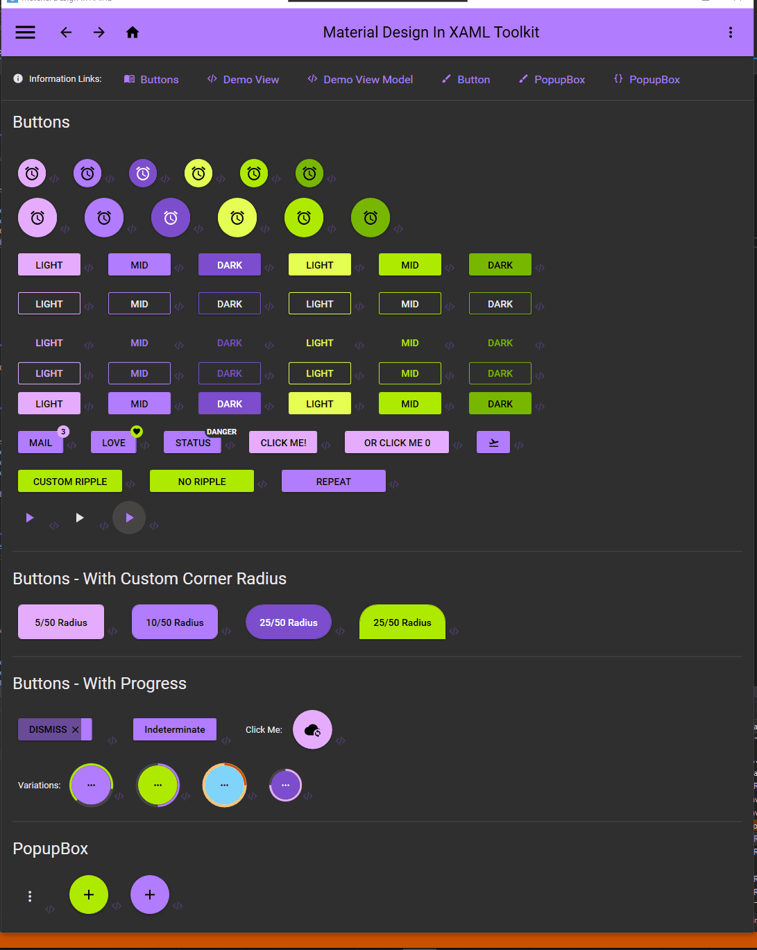
A lot of the demo project still needs expanding to include the secondary variants in place of the old accent variants, this is a start on that focusing on buttons.
I have also added a new variant 'Paper' buttons, they are a cross between raised and flat buttons, but at this point they explicitly use the paper and body colors, rather than transparent, my reason for this is they will still look appropriate with the theme but always stay dark or light. I find the normal buttons too overpowering and flat buttons too inconspicuous, and suspect others might like these too. I use a color zone on the test project to show them off.
I also added a toggle to disable or enable all the buttons to see what they look like