Message components
Message components are a framework for adding interactive elements to the messages your app or bot sends. They're accessible, customizable, and easy to use. Components are a new field on the message object, so you can use them whether you're sending messages or responding to a slash command or other interaction. The top-level components field is an array of Action Row components.
Action rows are containers for other components.
- You can have up to 5 Action Rows per message
- An Action Row cannot contain another Action Row
-
components(array): An array of message components
//Other Components can then be added to the action row
var _actionRow = new discordMessageComponentActionRow([_testButton]);Buttons are interactive components that render in messages. They can be clicked by users, and send an interaction to your app when clicked.
- Buttons must be sent inside an Action Row
- An Action Row can contain up to 5 buttons
- An Action Row containing buttons cannot also contain any select menu components
Official docs for buttons here.
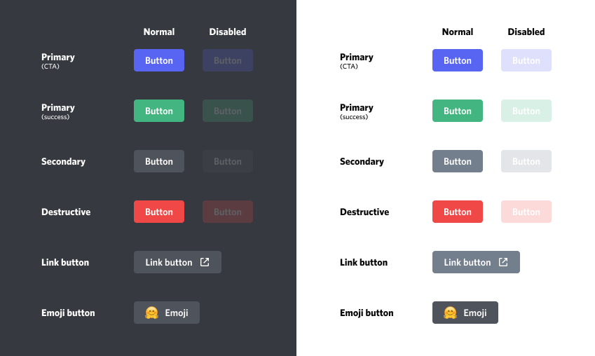
There are 5 different styles of buttons. Use the DISCORD_BUTTON_STYLE enum when inputing a style
- Non-link buttons must have a
customId, and cannot have aurl - Link buttons must have a
url, and cannot have acustomId - Link buttons do not send an interaction to your app when clicked
- When a user clicks on a non-link button, your app will receive an interaction via the gateway if your bot is connected. See Handling gateway events
-
customId(string): The custom identifier for the component. If the button is of the link type, this argument is ignored. -
label(string): The visible text on the button. -
style(enum.DISCORD_BUTTON_STYLE): The button style (Primary, Secondary, Success, Danger, Link). -
emoji(struct.discordEmoji, optional): The discordEmoji struct with "name", "id", and "animated" properties. Default: -1. -
url(string, optional): Only for link type buttons, the url that will open when the button is clicked. Default: "". -
disabled(bool, optional): Whether the button is disabled. Default: false.
//Create the message components
var _testButton = new discordMessageComponentButton("Test Button", "testButton", DISCORD_BUTTON_STYLE.primary);
//Buttons must be contained in an 'actionRow'
var _actionRow = new discordMessageComponentActionRow([_testButton]);

myBot.messageSend("1100867908755783694", "This is a message with a button", -1, [_actionRow]);
Result:

discordMessageComponentSelectMenu(type, customId, [options], [channelTypes], [placeholder], [minValues], [maxValues], [disabled])
var _option1 = new discordMessageComponentSelectOption("Option1", "test", "testing");
var _option2 = new discordMessageComponentSelectOption("Option2", "test2", "testing2");
var _selectMenu = new discordMessageComponentSelectMenu(DISCORD_COMPONENT_TYPE.stringSelect, "testselect", [_option1, _option2], -1, "Selecting", 1, 2);
var _actionRow = new discordMessageComponentActionRow([_selectMenu]);

myBot.messageSend(global.config.errorChannelId, "Select one", -1, [_actionRow]);
discordMessageComponent(type, [style], [label], [customId], [emoji], [url], [components], [options])
Constructs a new Discord message component. This constructor is all inclusive for every component type, but you probably want to use the individual constructors like [discordMessageComponentButton](# discordmessagecomponentbutton)
-
type(enum.DISCORD_COMPONENT_TYPE): The component type (actionRow, button, selectMenu, etc). -
style(enum.DISCORD_BUTTON_STYLE): The button style (Primary, Secondary, Success, Danger, Link). -
label{string}: The visible text on the button. -
customId{string}: The custom identifier for the component. -
emoji{struct.emoji}: The emoji object with "name", "id", and "animated" properties. -
url{string}: The URL for the Link button style (Link). -
components{Array}: Array of subcomponents -
options{Array}: The options for the Select Menu component (array of discordMessageComponentOption structs with "label", "value", "description", "emoji", and "default" properties).
var _testButton = new discordMessageComponent(DISCORD_COMPONENT_TYPE.button, DISCORD_BUTTON_STYLE.primary, "Generate More", -1, "testButton");
var _actionRow = new discordMessageComponent(DISCORD_COMPONENT_TYPE.actionRow, -1, "", -1, "actionRow", "", [_testButton]);