[RFC] New Input component #314
Description
New Input component
Problem description
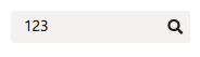
The current Input component looks like this:
API
<Input value="123" icon="search" placeholder="Search..." />DOM structure:
<div class="ui-input">
  <input type="text" placeholder="Search..." value="123" />
  <span class="ui-icon" aria-hidden="true"></span>
</div>
Rendered component:
This introduces a few issues. Since it directly creates an HTML <input /> element (implementation detail), it does not support a set of user scenarios:
1. Styling the <input />
It's impossible to target the <input /> element in order style it (e.g.: change the height of the input through styles) because it's not implemented as a shorthand slot.
Also, custom styles passed as prop will be set for the wrapping <div /> instead of <input />:
<Input placeholder="Search..." styles={{ backgroundColor: 'red' height: '80px' }} />renders:
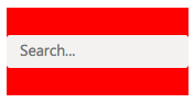
instead of expected:

2. Setting HTML attributes for the <input />
It's impossible to target the <input /> element in order to set attributes for it (e.g.: setting tabIndex="-1" to the <input /> element so that it's skipped by keyboard navigation).
- passing
tabIndex="-1"as prop adds it to the wrapping<div />so it doesn't work:
<Input placeholder="Search..." tabIndex="-1" />generates
<div class="ui-input" tabindex="-1">
  <input type="text" placeholder="Search..." value="" />
</div>- passing
input={{ tabIndex:"-1" }}as prop does not target the<input />element because it's not implemented as a shorthand slot:
<Input placeholder="Search..." input={{ tabIndex:"-1" }} />generates
<div class="ui-input" input="[object Object]">
  <input type="text" placeholder="Search..." value="" />
</div>
instead of expected
<div class="ui-input">
  <input type="text" placeholder="Search..." value="" tabindex="-1" />
</div>
3. Setting HTML attributes for the wrapping <div />
Because of implementation details, some HTML attributes (the ones specific to <input />) end up in the <input /> element instead of the wrapping <div />:
<Input placeholder="Search..." role="presentation" />generates
<div class="ui-input">
  <input type="text" placeholder="Search..." role="presentation" value="" />
</div>
instead of expected
<div class="ui-input" role="presentation">
  <input type="text" placeholder="Search..." value="" />
</div>
Proposed solutions
Both solutions rely on 2 main concepts:
i. Creating an additional standalone InputBase component
InputBase component will have the following structure:
Props:
interface IInputBaseProps {
  as?: any // TODO: decide if we want it
  className?: string
  defaultValue?: React.ReactText
  fluid?: boolean
  inline?: boolean
  onChange?: ComponentEventHandler<IInputProps>
  placeholder?: string
  value?: React.ReactText
  type?: string
  styles?: IComponentPartStylesInput
  variables?: ComponentVariablesInput
}
API
<Input placeholder="Search..." />DOM structure
<input type="text" placeholder="Search..." value="" />For simple scenarios where other actions / elements are not needed, InputBase is all the user needs. It will also fix all scenarios mentioned in the Problem description:
1. Styling the <input />
<InputBase placeholder="Search..." styles={{ backgroundColor: 'red' height: '80px' }} />2. Setting HTML attributes for the <input />
<InputBase placeholder="Search..." tabIndex="-1" />3. Setting HTML attributes for the wrapping <div />
N.A.
ii. Reimplementing Input using InputBase as shorthand
For scenarios like:
- input with
searchicon; - clearable input;
- clearable input with
searchicon;
Solution 1: wrapper prop
Input will leverage InputBase and use it internally.
All the props sent as <Input ...{props} /> will be passed to the InputBase unless the user clearly specifies they are for the wrapping element using the wrapper prop.
Props:
interface IInputProps extends IInputBaseProps {
  clearable?: boolean
  icon?: ItemShorthand
  wrapper?: ItemShorthand
}
API
<Input {...inputProps} wrapper={wrapperProps} />e.g.:
<Input
  placeholder="Search..."
  icon="search"
  clearable
  wrapper={{ role: "presentation" }}
/>
Component structure
<ElementType ...> // <div />
  <InputBase ... />  // <input />
  <Icon ...>  // <span />
</ElementType>
DOM structure
<div class="ui-input" role="presentation">
  <input type="text" placeholder="Search..." value="" />
  <span class="ui-icon" aria-hidden="true"></span>
</div>
This will solve all the scenarios mentioned above in the following fashion:
1. Styling the <input />
<Input
  placeholder="Search..."
  icon="search"
  clearable
  styles={{ backgroundColor: 'red' height: '80px' }}
/>
2. Setting HTML attributes for the <input />
<Input placeholder="Search..." tabIndex="-1" clearable />3. Setting HTML attributes for the wrapping <div />
<Input placeholder="Search..." wrapper={{ role: "presentation" }} />Solution 2: input slot
Input will leverage InputBase and use it as a shorthand slot, the same it does for Icon. The structure will be:
Props:
interface IInputProps extends IInputBaseProps {
  clearable?: boolean
  icon?: ItemShorthand
  input?: ItemShorthand
}
API
- preferred:
<Input placeholder="Search..." icon="search" clearable />- shorthand alternative 1 or when we need to target the
<input />:
<Input input={{ placeholder: "Search..." }} icon="search" clearable />- shorthand alternative 2 or when we need to target the
<input />:
<Input input={<InputBase placeholder="Search..." />} icon="search" clearable />Component structure
<ElementType ...> // <div />
  <InputBase ... />  // <input />
  <Icon ...>  // <span />
</ElementType>
DOM structure
<div class="ui-input">
  <input type="text" placeholder="Search..." value="" />
  <span class="ui-icon" aria-hidden="true"></span>
</div>
This will solve all the scenarios mentioned above in the following fashion:
1. Styling the <input />
<Input input={{ placeholder: "Search...", styles: { backgroundColor: 'red' height: '80px' } }} icon="search" clearable />2. Setting HTML attributes for the <input />
<Input input={{ placeholder: "Search...", tabIndex: "-1" }} clearable />3. Setting HTML attributes for the wrapping <div />
<Input placeholder="Search..." role="presentation" />