This repository was archived by the owner on Mar 4, 2020. It is now read-only.
feat(Form): base implementation #353
There are no files selected for viewing
This file contains hidden or bidirectional Unicode text that may be interpreted or compiled differently than what appears below. To review, open the file in an editor that reveals hidden Unicode characters.
Learn more about bidirectional Unicode characters
This file contains hidden or bidirectional Unicode text that may be interpreted or compiled differently than what appears below. To review, open the file in an editor that reveals hidden Unicode characters.
Learn more about bidirectional Unicode characters
| Original file line number | Diff line number | Diff line change |
|---|---|---|
| @@ -0,0 +1,38 @@ | ||
| import React from 'react' | ||
| import { Form, Button } from '@stardust-ui/react' | ||
|
|
||
| const fields = [ | ||
| { | ||
| label: 'First name', | ||
| name: 'firstName', | ||
| id: 'first-name-shorthand', | ||
| key: 'first-name', | ||
| required: true, | ||
| }, | ||
| { | ||
| label: 'Last name', | ||
| name: 'lastName', | ||
| id: 'last-name-shorthand', | ||
| key: 'last-name', | ||
| required: true, | ||
| }, | ||
| { | ||
| label: 'I agree to the Terms and Conditions', | ||
| control: { as: 'input' }, | ||
| type: 'checkbox', | ||
| id: 'conditions-shorthand', | ||
| key: 'conditions', | ||
| }, | ||
| { control: { as: Button, content: 'Submit' }, key: 'submit' }, | ||
| ] | ||
|
|
||
| const FormExample = () => ( | ||
| <Form | ||
| onSubmit={() => { | ||
| alert('Form submitted') | ||
| }} | ||
| fields={fields} | ||
| /> | ||
| ) | ||
|
|
||
| export default FormExample | ||
This file contains hidden or bidirectional Unicode text that may be interpreted or compiled differently than what appears below. To review, open the file in an editor that reveals hidden Unicode characters.
Learn more about bidirectional Unicode characters
| Original file line number | Diff line number | Diff line change |
|---|---|---|
| @@ -0,0 +1,22 @@ | ||
| import React from 'react' | ||
| import { Form, Button } from '@stardust-ui/react' | ||
|
|
||
| const FormExample = () => ( | ||
mnajdova marked this conversation as resolved.
Show resolved
Hide resolved
|
||
| <Form | ||
| onSubmit={() => { | ||
| alert('Form submitted') | ||
| }} | ||
| > | ||
| <Form.Field label="First name" name="firstName" id="first-name" required={true} /> | ||
| <Form.Field label="Last name" name="lastName" id="last-name" required={true} /> | ||
| <Form.Field | ||
| label="I agree to the Terms and Conditions" | ||
| control={{ as: 'input' }} | ||
| type="checkbox" | ||
| id="conditions" | ||
| /> | ||
| <Form.Field control={{ as: Button, content: 'Submit' }} /> | ||
| </Form> | ||
| ) | ||
|
|
||
| export default FormExample | ||
This file contains hidden or bidirectional Unicode text that may be interpreted or compiled differently than what appears below. To review, open the file in an editor that reveals hidden Unicode characters.
Learn more about bidirectional Unicode characters
| Original file line number | Diff line number | Diff line change |
|---|---|---|
| @@ -0,0 +1,40 @@ | ||
| import React from 'react' | ||
| import { Form, Button } from '@stardust-ui/react' | ||
|
|
||
| const fields = [ | ||
| { | ||
| label: 'First name', | ||
| name: 'firstName', | ||
| id: 'first-name-inline-shorthand', | ||
| key: 'first-name', | ||
| required: true, | ||
| inline: true, | ||
| }, | ||
| { | ||
| label: 'Last name', | ||
| name: 'lastName', | ||
| id: 'last-name-inline-shorthand', | ||
| key: 'last-name', | ||
| required: true, | ||
| inline: true, | ||
| }, | ||
| { | ||
| label: 'I agree to the Terms and Conditions', | ||
| control: { as: 'input' }, | ||
| type: 'checkbox', | ||
| id: 'conditions-inline-shorthand', | ||
| key: 'conditions', | ||
| }, | ||
| { control: { as: Button, content: 'Submit' }, key: 'submit' }, | ||
| ] | ||
|
|
||
| const FormExample = () => ( | ||
| <Form | ||
| onSubmit={() => { | ||
| alert('Form submitted') | ||
| }} | ||
| fields={fields} | ||
| /> | ||
| ) | ||
|
|
||
| export default FormExample |
This file contains hidden or bidirectional Unicode text that may be interpreted or compiled differently than what appears below. To review, open the file in an editor that reveals hidden Unicode characters.
Learn more about bidirectional Unicode characters
| Original file line number | Diff line number | Diff line change |
|---|---|---|
| @@ -0,0 +1,34 @@ | ||
| import React from 'react' | ||
| import { Form, Button } from '@stardust-ui/react' | ||
|
|
||
| const FormExample = () => ( | ||
| <Form | ||
| onSubmit={() => { | ||
| alert('Form submitted') | ||
| }} | ||
| > | ||
| <Form.Field | ||
| label="First name" | ||
| name="firstName" | ||
| id="first-name-inline" | ||
| inline={true} | ||
| required={true} | ||
| /> | ||
| <Form.Field | ||
| label="Last name" | ||
| name="lastName" | ||
| id="last-name-inline" | ||
| inline={true} | ||
| required={true} | ||
| /> | ||
| <Form.Field | ||
| label="I agree to the Terms and Conditions" | ||
| control={{ as: 'input' }} | ||
| type="checkbox" | ||
| id="conditions-inline" | ||
| /> | ||
| <Form.Field control={{ as: Button, content: 'Submit' }} /> | ||
| </Form> | ||
| ) | ||
|
|
||
| export default FormExample |
This file contains hidden or bidirectional Unicode text that may be interpreted or compiled differently than what appears below. To review, open the file in an editor that reveals hidden Unicode characters.
Learn more about bidirectional Unicode characters
| Original file line number | Diff line number | Diff line change |
|---|---|---|
| @@ -0,0 +1,20 @@ | ||
| import React from 'react' | ||
| import ComponentExample from 'docs/src/components/ComponentDoc/ComponentExample' | ||
| import ExampleSection from 'docs/src/components/ComponentDoc/ExampleSection' | ||
|
|
||
| const Types = () => ( | ||
| <ExampleSection title="Types"> | ||
| <ComponentExample | ||
| title="Default" | ||
| description="A default form." | ||
| examplePath="components/Form/Types/FormExample" | ||
| /> | ||
| <ComponentExample | ||
| title="Inline" | ||
| description="The form controls can appear next to the label instead of below it." | ||
| examplePath="components/Form/Types/FormExampleInline" | ||
| /> | ||
| </ExampleSection> | ||
| ) | ||
|
|
||
| export default Types |
This file contains hidden or bidirectional Unicode text that may be interpreted or compiled differently than what appears below. To review, open the file in an editor that reveals hidden Unicode characters.
Learn more about bidirectional Unicode characters
| Original file line number | Diff line number | Diff line change |
|---|---|---|
| @@ -0,0 +1,10 @@ | ||
| import React from 'react' | ||
| import Types from './Types' | ||
|
|
||
| const FormExamples = () => ( | ||
| <div> | ||
| <Types /> | ||
| </div> | ||
| ) | ||
|
|
||
| export default FormExamples |
This file contains hidden or bidirectional Unicode text that may be interpreted or compiled differently than what appears below. To review, open the file in an editor that reveals hidden Unicode characters.
Learn more about bidirectional Unicode characters
| Original file line number | Diff line number | Diff line change |
|---|---|---|
| @@ -0,0 +1,128 @@ | ||
| import * as PropTypes from 'prop-types' | ||
| import * as React from 'react' | ||
| import * as _ from 'lodash' | ||
|
|
||
| import { UIComponent, childrenExist, customPropTypes } from '../../lib' | ||
| import { ComponentVariablesInput, ComponentPartStyle } from '../../../types/theme' | ||
| import { | ||
| ComponentEventHandler, | ||
| Extendable, | ||
| ReactChildren, | ||
| ShorthandValue, | ||
| ShorthandRenderFunction, | ||
| } from '../../../types/utils' | ||
| import FormField from './FormField' | ||
|
|
||
| export interface IFormProps { | ||
| action?: string | ||
mnajdova marked this conversation as resolved.
Show resolved
Hide resolved
|
||
| as?: any | ||
| children?: ReactChildren | ||
mnajdova marked this conversation as resolved.
Show resolved
Hide resolved
|
||
| className?: string | ||
| content?: ShorthandValue | ||
| fields?: ShorthandValue[] | ||
| onSubmit?: ComponentEventHandler<IFormProps> | ||
| renderField?: ShorthandRenderFunction | ||
| styles?: ComponentPartStyle | ||
| variables?: ComponentVariablesInput | ||
| } | ||
|
|
||
| /** | ||
| * A Form displays a set of related user input fields in a structured way. | ||
| * @accessibility | ||
| * Label needs to be provided by using 'aria-label', or 'aria-labelledby' attributes on the <form> element. | ||
| */ | ||
| class Form extends UIComponent<Extendable<IFormProps>, any> { | ||
| static create: Function | ||
|
|
||
| public static displayName = 'Form' | ||
|
|
||
| public static className = 'ui-form' | ||
|
|
||
| public static propTypes = { | ||
| /** The HTML form action. */ | ||
| action: PropTypes.string, | ||
|
|
||
| /** An element type to render as (string or function). */ | ||
| as: customPropTypes.as, | ||
|
|
||
| /** | ||
| * Form content for childrenApi. | ||
| * @docSiteIgnore | ||
| */ | ||
| children: PropTypes.node, | ||
|
|
||
| /** Additional CSS class name(s) to apply. */ | ||
| className: PropTypes.string, | ||
|
|
||
| /** Shorthand for primary content. */ | ||
| content: customPropTypes.contentShorthand, | ||
|
|
||
| /** Shorthand array of props for the Form.Fields inside the Form. */ | ||
| fields: customPropTypes.collectionShorthand, | ||
|
|
||
| /** | ||
| * The HTML form submit handler. | ||
| * @param {SyntheticEvent} event - React's original SyntheticEvent. | ||
| * @param {object} data - All props. | ||
| */ | ||
| onSubmit: PropTypes.func, | ||
|
|
||
| /** | ||
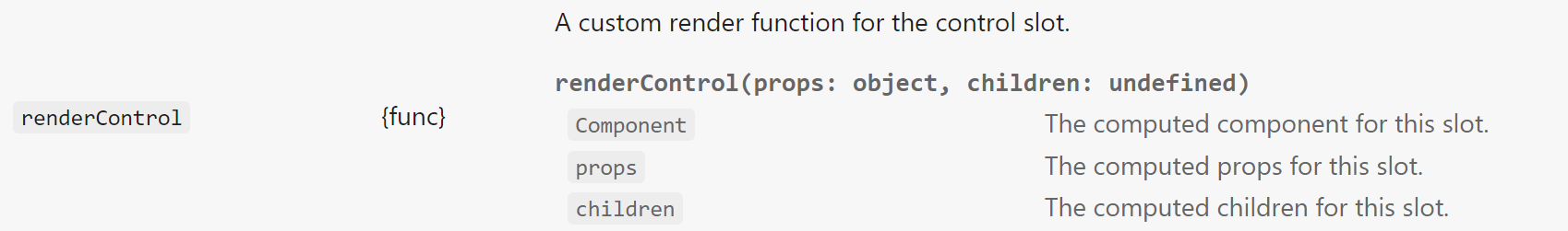
| * A custom render iterator for rendering each of the Form fields. | ||
| * The default component, props, and children are available for each field. | ||
| * | ||
| * @param {React.ReactType} Component - The computed component for this slot. | ||
|
Contributor
There was a problem hiding this comment. just to be sure, what are the scenarios where these JS Doc attributes (like @param) will augment IntelliSense experience? Maybe it is safe for us to just avoid them, if there is no much value in them?
Contributor
Author
There was a problem hiding this comment. They are differently displayed in the props table in the docs |
||
| * @param {object} props - The computed props for this slot. | ||
| * @param {ReactNode|ReactNodeArray} children - The computed children for this slot. | ||
| */ | ||
| renderField: PropTypes.func, | ||
|
|
||
| /** Additional CSS styles to apply to the component instance. */ | ||
| styles: PropTypes.oneOfType([PropTypes.object, PropTypes.func]), | ||
|
|
||
| /** Override for theme site variables to allow modifications of component styling via themes. */ | ||
| variables: PropTypes.oneOfType([PropTypes.object, PropTypes.func]), | ||
| } | ||
|
|
||
| public static defaultProps = { | ||
| as: 'form', | ||
| } | ||
|
|
||
| public static Field = FormField | ||
|
|
||
| public renderComponent({ | ||
| ElementType, | ||
| classes, | ||
| accessibility, | ||
| variables, | ||
| styles, | ||
| rest, | ||
| }): React.ReactNode { | ||
| const { action, children } = this.props | ||
| return ( | ||
| <ElementType className={classes.root} action={action} onSubmit={this.handleSubmit} {...rest}> | ||
| {childrenExist(children) ? children : this.renderFields()} | ||
| </ElementType> | ||
| ) | ||
| } | ||
|
|
||
| private handleSubmit = (e, ...args) => { | ||
| const { action } = this.props | ||
|
|
||
| // Heads up! Third party libs can pass own data as first argument, we need to check that it has preventDefault() | ||
| // method. | ||
| if (!action) _.invoke(e, 'preventDefault') | ||
| _.invoke(this.props, 'onSubmit', e, this.props, ...args) | ||
|
Contributor
There was a problem hiding this comment. could you, please, suggest the case where these
Contributor
Author
There was a problem hiding this comment. If there are some additional arguments sent here, for example if the form is going to be used with some additional library (as for validation for example) we must propagate this arguments further. Also taken from Semantic UI, made sense to me. |
||
| } | ||
|
|
||
| private renderFields = () => { | ||
| const { fields, renderField } = this.props | ||
| return _.map(fields, field => | ||
| FormField.create(field, { | ||
| render: renderField, | ||
| }), | ||
| ) | ||
| } | ||
| } | ||
|
|
||
| export default Form | ||
Oops, something went wrong.
Add this suggestion to a batch that can be applied as a single commit.
This suggestion is invalid because no changes were made to the code.
Suggestions cannot be applied while the pull request is closed.
Suggestions cannot be applied while viewing a subset of changes.
Only one suggestion per line can be applied in a batch.
Add this suggestion to a batch that can be applied as a single commit.
Applying suggestions on deleted lines is not supported.
You must change the existing code in this line in order to create a valid suggestion.
Outdated suggestions cannot be applied.
This suggestion has been applied or marked resolved.
Suggestions cannot be applied from pending reviews.
Suggestions cannot be applied on multi-line comments.
Suggestions cannot be applied while the pull request is queued to merge.
Suggestion cannot be applied right now. Please check back later.
Uh oh!
There was an error while loading. Please reload this page.