Remove extra margin from warning messages in authenticate page#15407
Merged
MorrisJobke merged 1 commit intomasterfrom May 7, 2019
Merged
Conversation
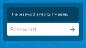
In the public share authentication page the form elements appear inside
a container that uses the "warning" CSS class. When the given password
is wrong a warning message is shown inside that container; this message
uses the "warning" CSS class too, so the top margin set for ".warning"
elements need to be removed in that case.

Signed-off-by: Daniel Calviño Sánchez <danxuliu@gmail.com>
Member
Author
|
/backport to stable16 |
juliusknorr
reviewed
May 7, 2019
| background-color: transparent !important; | ||
| } | ||
|
|
||
| .warning > .warning { |
|
backport to stable16 in #15409 |
This file contains hidden or bidirectional Unicode text that may be interpreted or compiled differently than what appears below. To review, open the file in an editor that reveals hidden Unicode characters.
Learn more about bidirectional Unicode characters
Sign up for free
to join this conversation on GitHub.
Already have an account?
Sign in to comment
4 participants
Add this suggestion to a batch that can be applied as a single commit.This suggestion is invalid because no changes were made to the code.Suggestions cannot be applied while the pull request is closed.Suggestions cannot be applied while viewing a subset of changes.Only one suggestion per line can be applied in a batch.Add this suggestion to a batch that can be applied as a single commit.Applying suggestions on deleted lines is not supported.You must change the existing code in this line in order to create a valid suggestion.Outdated suggestions cannot be applied.This suggestion has been applied or marked resolved.Suggestions cannot be applied from pending reviews.Suggestions cannot be applied on multi-line comments.Suggestions cannot be applied while the pull request is queued to merge.Suggestion cannot be applied right now. Please check back later.
In the public share authentication page the form elements appear inside a container that uses the
warningCSS class. When the given password is wrong a warning message is shown inside that container; this message uses thewarningCSS class too, so the top margin set for.warningelements need to be removed in that case.The extra margin is there even in Nextcloud 14, but as it is just a style fix I think that backporting just to Nextcloud 16 is enough (but feel free to call backportbot if you disagree ;-) ).
Before:
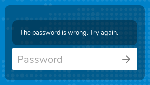
After: