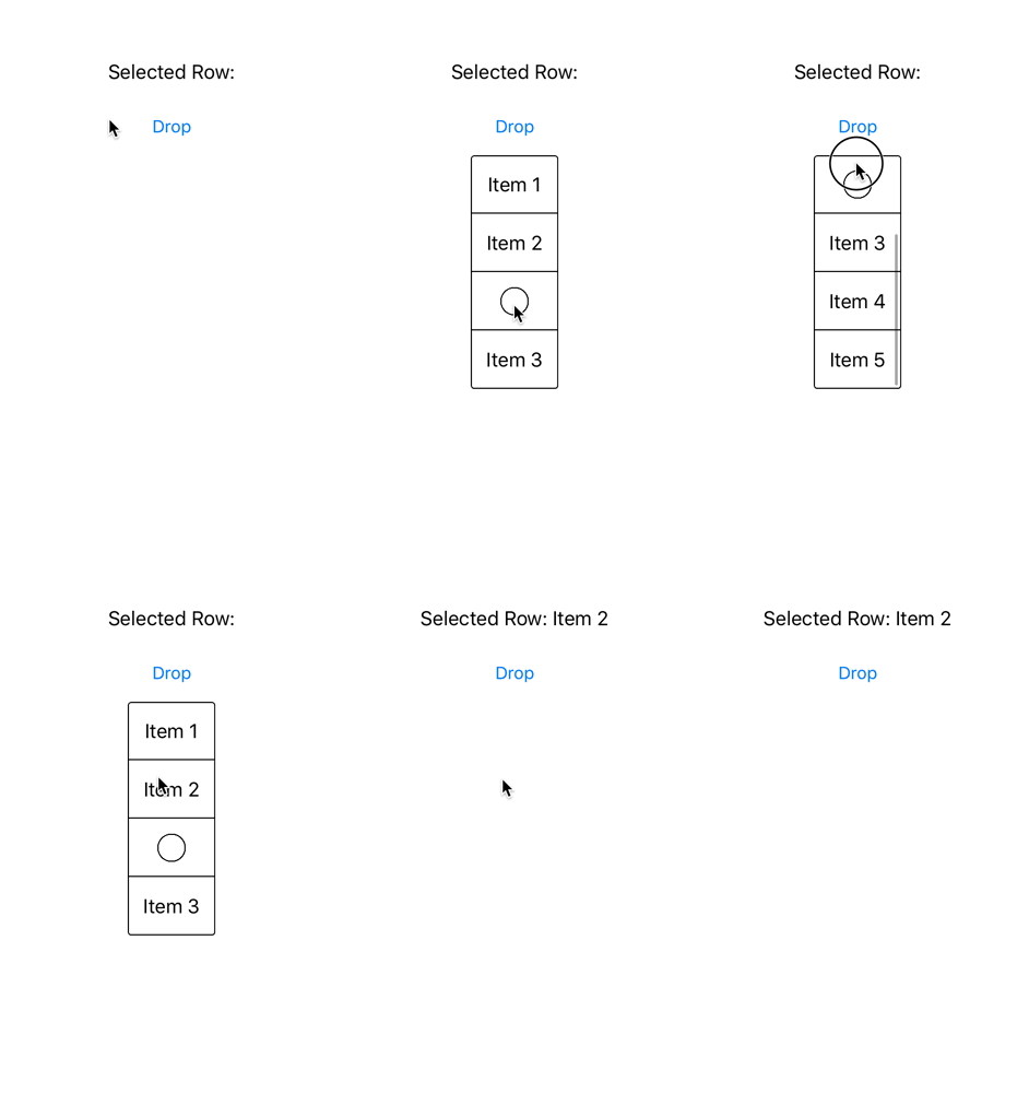
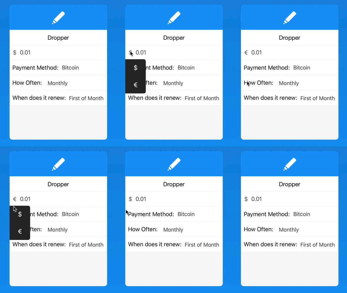
Dropper is a simple Dropdown menu for iOS. Built with customizability in mind and is flexible on how it can be used. Also, it is easy to setup and use in your projects. If you are looking for some complex dropdown menu, this is not for you. This was more built to be used as an accessory to a view. For example being able to change your currency in a shopping cart app.
Left demo of a basic Dropper menu. Right is how Dropper is used in Outflow.
Dropper is available through CocoaPods. To install it, simply add the following line to your Podfile:
pod "Dropper"Setting up is easy, after installing the library, initialize a Dropper menu in your view
let dropper = Dropper(width: 75, height: 200)After your Dropper view is initialized, you gotta specify which items to be displayed inside the Dropper
dropper.items = ["Item 1", "Item 2", "Item 3", "Item 4"] // Items to be displayed
// Dropper also supports images
dropper.items = ["Item 1", "ImageOne.png", "Item 3", "ImageTwo.png"] // Images can be mixed with text items
When you are ready to show your Dropper menu you have two options for how to display it: show() or showWithAnimation().
dropper.show(options: .Alignment.Center, button: UIButton)
// OR
dropper.showWithAnimation(0.15, options: .Alignment.Center, button: UIButton)
When you are ready to get back what Dropper item was selected, confrom your class to the DropperDelegate and implement the DropperSelectedRow method, it is also importent that you initialize the dropper.delegate property to your class before showing your view.
dropper.delegate = self // Insert this before you show your Dropper

extension ViewController: DropperDelegate {
    func DropperSelectedRow(path: NSIndexPath, contents: String) {
        /* Do something */
    }
}class ViewController: UIViewController {
let dropper = Dropper(width: 75, height: 200)
@IBOutlet var dropdownButton: UIButton!
@IBAction func DropdownAction() {
if dropper.status == .Hidden {
dropper.items = ["Item 1", "Item 2", "Item 3", "Item 4"] // Item displayed
dropper.theme = Dropper.Themes.White
dropper.delegate = self
dropper.cornerRadius = 3
dropper.showWithAnimation(0.15, options: Dropper.Alignment.Center, button: dropdownButton)
} else {
dropper.hideWithAnimation(0.1)
}
}
}Shows the Dropdown Menu
show(options: Alignment, position: Position = .Bottom, button: UIButton)- options Dropper.Alignment: Vertical position of the dropdown corresponding of the button (Left, Center, Right)
- position Dropper.Position: Horizontal alignment of the dropdown. Defaults to under the button.
- button UIButton: Button that button will be position relative too Shows the Dropdown menu with a fade animation
showWithAnimation(time: NSTimeInterval, options: Alignment, position: Position = .Bottom, button: UIButton)- time NSTimeInterval: Time taken for the fade animation
- options Dropper.Alignment: Position of the dropdown corresponding of the button (Left, Center, Right)
- position Dropper.Position: Horizontal alignment of the dropdown. Defaults to under the button.
- button UIButton: Button that button will be position relative too
// Dropdown displayed on top of the button
dropper.showWithAnimation(0.15, options: Dropper.Alignment.Center, position: .Top, button: button)
// Dropdown displayed under the button
dropper.showWithAnimation(0.15, options: Dropper.Alignment.Center, button: button)Hides the Dropdown Menu
hide()Hides the Dropdown menu with an fade out animationhideWithAnimation(time: NSTimeInterval)- time NSTimeInterval: Time taken for the fade out animation
trimCornersBool: Automaticly applies border radius of 10 to Dropdown (Defaults to False)defaultAnimationTimeNSTimeInterval: The default time for animations to take (Defaults to 0.1)delegateDropperDelegate: Delegate property, must be initialized for the functions to be calledDropperSelectedRow: Called everytime a Dropper row is selected
statusStatus (Enum): The current state of the viewspacingCGFloat: The distance from the button to the DroppermaxHeightCGFloat: The maximum possible height of the DroppercellBackgroundColorUIColor: Sets the cell background color (Defaults to theme color if not set)cellColorUIColor: Sets the cell tint color and text color (Defaults to theme color if not set)cellTextSizeCGFloat: Sets the size of the text to provided value (Defaults to UILabel Font Size)TableMenuUITableView: Table View that the Dropper is built onitems[String]: The items to be dispalyed in the tableviewheightCGFloat: Height of the DropdownwidthCGFloat: Width of the DropdowncornerRadiusCGFloat: Corner Radius of the DropdownthemeThemes (Enum): Theme of dropdown menu (Defaults to White theme).White: Black text color, White background Color and black border color.Black(UIColor): White Text, Dark background color, you can also specify your own color, or use the default by passing nil to the enum case
dropper.theme = Dropper.Themes.Black(nil) // Uses default dark color
// OR
dropper.theme = Dropper.Themes.Black(UIColor.blackColor()) // Uses Black UIColorborder(width: CGFloat, color: UIColor): Specify the border width and the color of the Dropper
dropper.border = (width: 2, color: UIColor.blueColor())refresh(): Refresh the Dropper. For specifically calling .reloadData() on the Table View
Dropper is available under the MIT license. See the LICENSE file for more info.
Built by Ozzie Kirkby, if you have any question feel free to contact. Twitter

