Conversation
Codecov Report
@@            Coverage Diff             @@
##           master      #64      +/-   ##
==========================================
+ Coverage   69.72%   70.39%   +0.67%
==========================================
  Files          70       73       +3
  Lines        1133     1179      +46
  Branches      215      222       +7
==========================================
+ Hits          790      830      +40
- Misses        338      344       +6
  Partials        5        5
Continue to review full report at Codecov.
|

| </Menu.Item> | ||
| <Menu.Item active> | ||
| <Input | ||
| <SemanticUIInput |
There was a problem hiding this comment.
This would be a great place to dog food our own new Input component!
I think Stardust's first Input iteration will support everything that is needed here, except icon. The styling won't look quite as nice until we introduce inverted and fluid, but that is ok. It will serve as a reminder to us.
There was a problem hiding this comment.
will add in a different PR
src/components/Input/Input.tsx
Outdated
| focus: PropTypes.bool, | ||
|
|
||
| /** Optional Icon to display inside the Input. */ | ||
| icon: PropTypes.oneOfType([PropTypes.bool, customPropTypes.itemShorthand]), |
There was a problem hiding this comment.
I know this is still being worked on. Just a reminder to trim it down to the minimal implementation for the first PR.
 alinais
force-pushed
the
feature/input-component
branch
from
alinais
force-pushed
the
feature/input-component
branch
from
82b540d to
b6451cb
Compare
alinais
force-pushed
the
feature/input-component
branch
from
97e3378 to
0aed4ac
Compare
src/components/Input/inputRules.ts
Outdated
|
|
||
| icon: ({ props, variables }) => { | ||
| return { | ||
| position: 'absolute', |
There was a problem hiding this comment.
Not sure if you're looking for css feedback here (or if this is just a first-pass for controls), but can we change this to use flexbox? I think we could replace most of the styles with something like this:
display: inline-flex;
align-items: center;
justify-content: flex-end;
There was a problem hiding this comment.
@notandrew this is a first implementation for this component. But I am updating the rules to a more simple approach. Thanks for your advice. Please check the updates.
src/components/Input/inputRules.ts
Outdated
| border: variables.defaultBorder, | ||
| borderRadius: variables.borderRadius, | ||
| outline: 0, | ||
| padding: `${pxToRem(6)} 0 ${pxToRem(6)} ${pxToRem(10)}`, |
There was a problem hiding this comment.
I would introduce the padding value as a variable as well, so that the users of the component can override it if they want.
There was a problem hiding this comment.
can you expand on that @mnajdova ? why isn't it possible using the regular style object? what would be the expected API for a user that wants to set his own padding? some examples would be great
There was a problem hiding this comment.
So, if I am user of the Input component, if the padding is provided as variable, I could use:
<Input variables={{padding: '0px'}} />
and this would override the default defined padding. There is example of this in the Avatar component, regarding using the Label component.
There was a problem hiding this comment.
I was hitting this today, I didn't understand why my styles were overwritten, it's kind of strange that we have to do it like this; if I'm not wrong, we have 2 or 3 ways of passing styling to components:
- using
classNameprop, which is the most obvious one and I think should be used; however it's not reliable because if a certain CSS property is defined in the rules of a component it cannot be overwritten by classes passed using className; - using
variablesprop in order to override variables that we pass to the rules; - using
stylesnative prop?
What's the benefit of introducing this behavior (using variables) to using styles native prop?
 alinais
force-pushed
the
feature/input-component
branch
from
alinais
force-pushed
the
feature/input-component
branch
from
64fcc89 to
0586ff7
Compare
5 participants
Input
A standard input field.
TODO
API Proposal
Default input component
(contains only the placeholder)
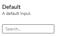
The placeholder is a property that can be added to an input.
will output
Input with an icon
An input in a search component can have a search icon.
will output