Conversation
|
Minor feedback on naming: Have you considered other names for this such as a A |
You can check
A
I have the same opinion there, |
|
That's fair reasoning, sorry I should have looked at the PR content! :) What about
Truthfully a progress bar and a spinner probably could be combined. Both can be either determinate or indeterminate. They just look different. Similar to a primary button vs a primary circular button. |
NP 😺
We want to define it as a separate component, instead of a
I've seen an indeterminate Personally for me, it looks a little strange because I think that |
ProgressThere is a standard HTML element which establishes the name <progress value="22" max="100"></progress>
Spinner / LoaderSpinner is widely used and it makes this decision a little more difficult. The term Loader is not rare by any means: https://www.w3schools.com/howto/howto_css_loader.asp In fact, the terms are often used together "loading spinner". This is true in component names and even icon names, such as Naming PrinciplesWe fall back to naming principles to decide these things:
This is the reason we use "primary button" vs "blue button" and "loader" vs "spinner". Examples of non-spinning loading indicators: It would be unfortunate if the majority of loading indicators in 2023 didn't spin anymore, but maybe pulsed, and our component was called "Spinner". We'd eventually want to rename it "Pulser" if we followed that logic. It's intent and usage, however, will never change. It will always be used to indicate that something is loading. So names should follow intent and usage, when possible. |


|
Going to merge this PR, feel free to propose any changes via new PRs 👍 |
|
Just some more info: A A
So the only difference we're seeing between these two is style variant. So I'd love to agree on some single name here with some variant. Also fwiw on the I think we'd still prefer |
|
Including @Jahnp @aditima @micahgodbolt |
|
Naming is hard :) @levithomason, the naming principles you listed above make a lot of sense. To me, the name Also, whether we do a determinate or indeterminate indicator often depends on the back-end capabilities and not a real semantic difference. I feel more comfortable with these being just variations of the same component, as opposed to completely different components. Not sure if |
|
Minor note as well, MUI uses |
|
Valid points @aditima and @dzearing, I really appreciate the input. Component boundaries are both difficult and very interesting. After the below deep think and review, my take aways are:
We probably need to start including 1) definitions 2) states and 3) variations with our specs. This should help us find the balance between design guidelines and engineered component boundaries. I might suggest the following components based on the below findings:
These are perhaps all part of the "Loading" category. The Long Story Single APII can see the "something is progressing" similarity between a Loader and a Progress component. If we consider what the API might look like for using a single component: <ProgressIndicator bar /> // horizontal progress bar
<ProgressIndicator bar circular /> // circular progress bar
<ProgressIndicator spinner /> // an infinite loading animation
// etcThese cases make sense, though, I see a lot of conflicts once you get into defining the specifics of each of these. Example, you would need properties for defining a progress bar that would not apply to the spinner case, etc. It seems design guides tend to think about pending activity as a single category, such as the Material UI guide on "Progress & Activity" and Apple's guide on "Loading", whereas, engineering implementations tend to separate the concerns. This makes sense due to the constraints of designers vs engineers, but also makes naming quite difficult. This may be showing us we need to get into naming of the actual states, anatomies, and properties. It just might be that the spec gives the names alone, but the implementation might structure those differently, as seen with the Material IO guide on "Progress Indicators" vs the Material UI components DifferencesI think there are enough differences in the properties, anatomy, and usage of these two components that also warrant a component boundary.
SimilaritiesThere are few things in common, such as both are used when something is pending. However, under this definition we might ask why Placeholders or Shimmers are also not the same component. There is precedent for component API boundaries which have great similarities. Such as an Image and an Avatar. From an engineering stand point, the boundary is useful as it allows us to target styles, anatomies, and variations without abusing abstractions. IMHO, merging the "loading" and "progress" concepts into one component would be difficult to maintain. Loader NamingI definitely agree that the term Loader has room for improvement. Let's look around a bit more at namings. It seems there are several purposes, indicate infinte loading, show automated progress, show step driven progress, and stubbing pending content.
Doing some Google searches and reading around design articles, I also see Skeleton Screen as an emerging term for content placeholders. |
|
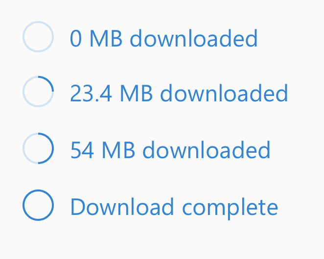
Reading through the differences table above, I still think that both can be either determinate or indeterminate. Both bar and spinner scenarios can be either determinate or indeterminate: You may have a series of bars showing progress on a variety of operations. Some are determinate, while others may simply be indeterminate because the operation duration is unpredictable. For this case, yes you could use a mix of bars and spinners, but this would result in some ux asymmetry. Youtube-like bar loaders at the top, below the header, are often indeterminate. Sometimes they "fake" determinate (e.g. they progress artificially and slow down exponentially as they get closer to 100%). Other times (e.g. "dancing ants" in Metro ui) they embrace being indeterminate. Still a horizontal bar like unit. You may use determinate spinners due to ui spacing. E.g. a button which represents a progressing, determinate number of steps may want to use a determinate spinner inline. Again, due to ux aesthetics, you wouldn't represent this as an inline bar in the button. The shared commonality here is that bars vs spinners is really boils down to a UX aesthetics decision I think, and both cases have determinate and indeterminate representations. I do think "circular" vs "horizontal" are mutually exclusive. Just to reiterate though... in the screenshot I posted above, you have spinners that have a unit (MB) and a value. The only real distinction I can think of is that we've seen requests for small/medium/large spinner variants, but never for small/medium/large bars. That's what leads me to the "variant" concept. If we want to provide N visual representations of progress, using a variant prop would leave that open a bit. |
|
Confirming indeterminate progress indicators are a thing regardless of their shape (bar or circular or something else). We should probably start a new PR or issue that further specifies the properties of components related to progress and activity. I'm also thinking we need to support some kind of wiki footnotes where we can reference sources for our findings. Loading Spinner vs Circular Progress
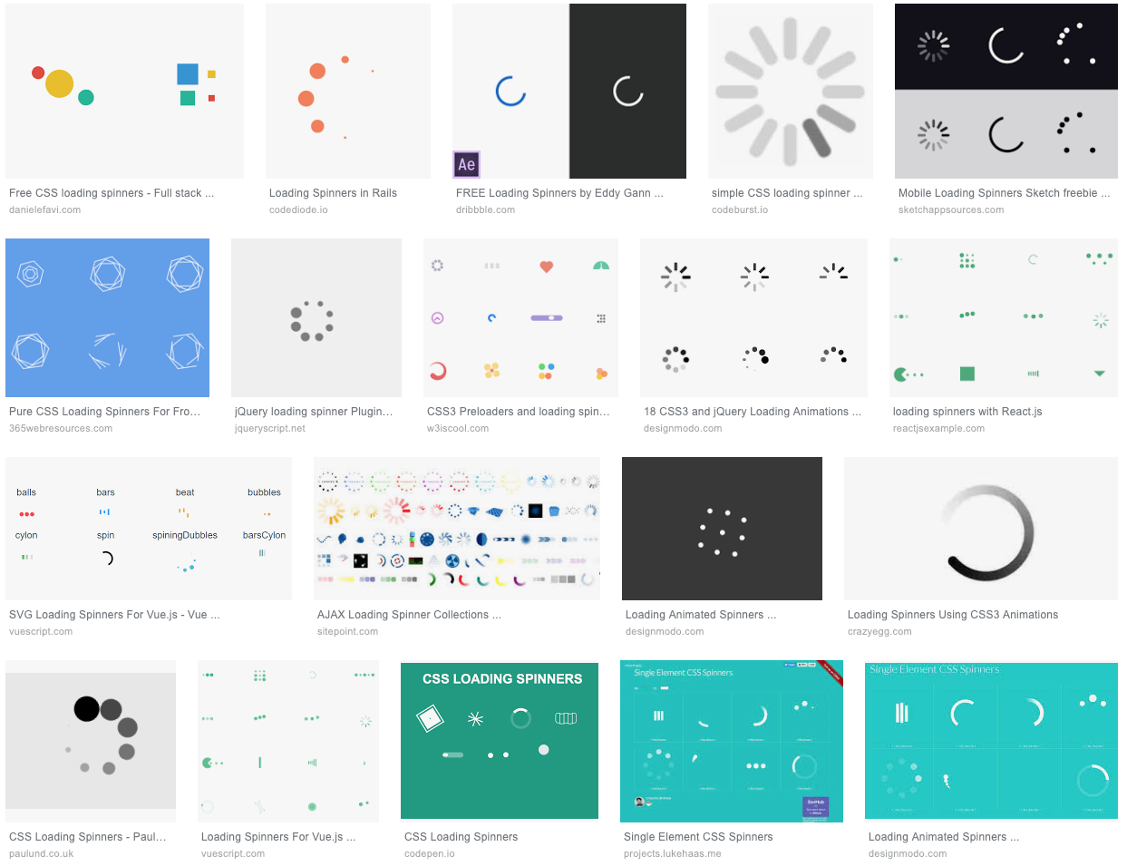
Note, the screenshot posted is not a spinner but a circular progress bar. The two are fundamentally different. Progress bars have a track, a bar, a unit of measure, current value, total value, and they end on completion. Loading spinners have none of these properties nor anatomy. Loading Spinner
Except for the track and bar design, this shows how none of the progress properties can be applied to most loading spinners. There is no way to indicate a progression from 0 to completion.
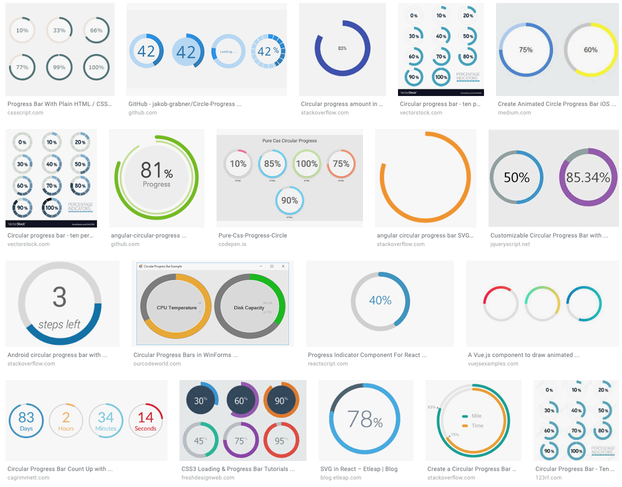
Circular Progress
While you can put a circular progress bar into an
Since we need to support all loading spinners and all forms of progress bars it isn't feasible or reasonable to attempt and put all these needs behind one engineered solution. From a design guide perspective, they do belong in the same category. |
|
Thanks @levithomason. I think I am getting sold on the idea that 'determinate' and 'indeterminate' are two different entities from an engineering point of view, and the various shapes are just variants of each. Design needs to be responsible for keeping these visually consistent - it doesn't make sense for a circular determinate progress to look too different from a circular indeterminate progress in the same product. What is the big difference between 1. Progress Bar/ 2. Progress Steps and 3. Loading Spinner/ 4. Content Placeholder in you chart above? Seems like 1 and 2 can be served by the same determinate component and 3 and 4 by the indeterminate one. |
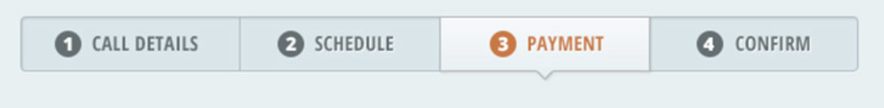
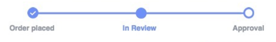
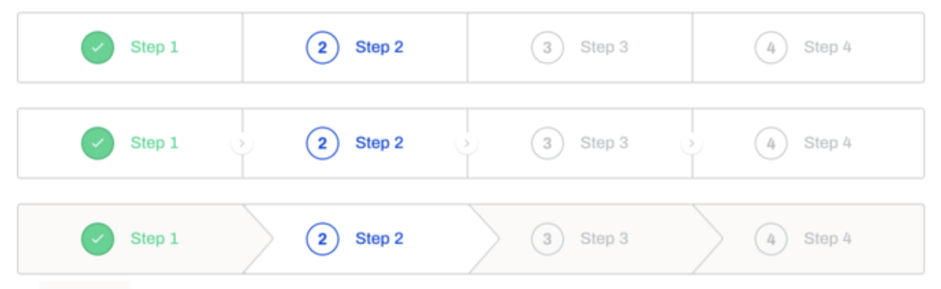
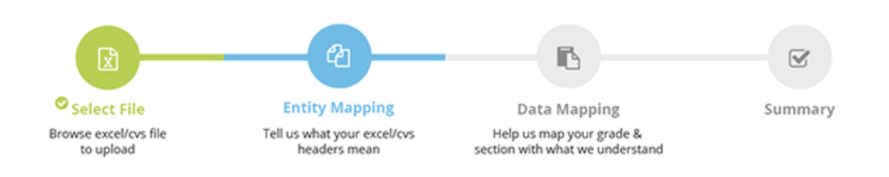
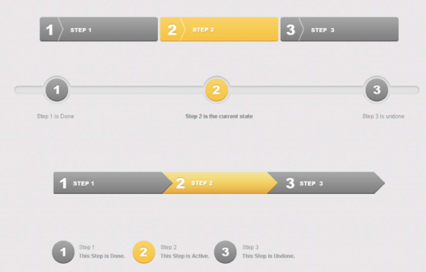
In some of the themes these are very similar components. However, as with the extreme variation of loading spinners I don't think it will be feasible to put all "step" components into the same component as the progress bar. We'd need to do another deep dive on step components, but here's a quick peek to see:
As shown, Steps appear as a group of Step components. Each step can have a label/text, an icon, and a state (active, complete, disabled, pending, etc). The styling is also typically quite different than a Progress Bar, though again, sometimes it is similar. I think anytime there is significant departure in anatomy and properties, there is likely an engineering component boundary. Example, most "Progress Steps" do not have a track and a bar (anatomy) and they do not support percentages. Steps are more about discrete labeled sequences. Progress Bars on the other hand typically support a bar only, so there are no discrete "steps" within it to give state and style to. Again, from a UX or design perspective I think these belong to same subdomain, however, from an engineering point of view managing the branching of logic, anatomy, and properties would be very difficult in a single component API. |


|
For content placeholders, see the links in the comparison table above. Content placeholders are just gray boxes and circles shaped paragraphs and images. These are also very distinct from all the other forms of progress indicators. |
|
One other alternative that was suggested for indeterminate progress was just |
4 participants
No description provided.