Update button background in dark mode to match design spec#5187
Merged
chasestarr merged 3 commits intouber:masterfrom Oct 4, 2022
Merged
Update button background in dark mode to match design spec#5187chasestarr merged 3 commits intouber:masterfrom
chasestarr merged 3 commits intouber:masterfrom
Conversation
 merriechristopher
requested review from
chasestarr,
lhbrennan and
tajo
as code owners
merriechristopher
requested review from
chasestarr,
lhbrennan and
tajo
as code owners
|
|
|
This pull request is automatically built and testable in CodeSandbox. To see build info of the built libraries, click here or the icon next to each commit SHA. Latest deployment of this branch, based on commit 2e2c554:
|
This file contains hidden or bidirectional Unicode text that may be interpreted or compiled differently than what appears below. To review, open the file in an editor that reveals hidden Unicode characters.
Learn more about bidirectional Unicode characters
Sign up for free
to join this conversation on GitHub.
Already have an account?
Sign in to comment
3 participants
Add this suggestion to a batch that can be applied as a single commit.This suggestion is invalid because no changes were made to the code.Suggestions cannot be applied while the pull request is closed.Suggestions cannot be applied while viewing a subset of changes.Only one suggestion per line can be applied in a batch.Add this suggestion to a batch that can be applied as a single commit.Applying suggestions on deleted lines is not supported.You must change the existing code in this line in order to create a valid suggestion.Outdated suggestions cannot be applied.This suggestion has been applied or marked resolved.Suggestions cannot be applied from pending reviews.Suggestions cannot be applied on multi-line comments.Suggestions cannot be applied while the pull request is queued to merge.Suggestion cannot be applied right now. Please check back later.
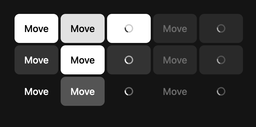
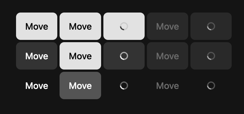
Update the buttonPrimaryFill color token dark mode mapping to match design specDescription
Currently all Primary buttons have a component specific color token that maps them to white in a dark mode theme. This change replaces the mapping to the correct color token to match the design spec (
primaryA)Note: Long term, we should remap all component color tokens to map to semantic ones (
backgroundInversePrimary) over the primitives.Before:
After:
Scope
Bugfix