feat(Label): add icon, iconPosition and onIconClick props#19
feat(Label): add icon, iconPosition and onIconClick props#19
Conversation
 mnajdova
requested review from
dvdzkwsk,
kuzhelov and
levithomason
as code owners
mnajdova
requested review from
dvdzkwsk,
kuzhelov and
levithomason
as code owners
Codecov Report
@@            Coverage Diff             @@
##           master      #19      +/-   ##
==========================================
+ Coverage   82.94%   84.05%   +1.11%
==========================================
  Files          59       59
  Lines         850      878      +28
  Branches      195      207      +12
==========================================
+ Hits          705      738      +33
+ Misses        141      136       -5
  Partials        4        4
Continue to review full report at Codecov.
|

-renamed classes for the removable icon examples
-added tests for handling the onRemove call on clicking the remove icon
# Conflicts:
#	src/components/Icon/Icon.tsx
|
what I am worrying about a bit is by tying <Label ... onRemove={ onRemoveLogic } />Suppose, for the sake of example, that
What I would expect instead is that Another thing that seems to be a one that requires additional thoought is whether we could do a bit better in providing this functionality as something more generic, something that is able to handle wider set of cases. Once again, for the sake of example, I might think about the same 'Label with Icon' concept to represent the following UI control: a label that has 'plus' icon with drop down menu appearing when 'plus' icon is clicked - in that case it won't be about 'removing' anything, while still we will use the same logic behind. What we might do to embrace these situations as well is to support the following: <Label ... icon={{ type='minus' onClick={ .. } }} />While I do understand that this way of achieving the same effect requires more typing, frankly I would rather prefer to introduce generic functionality, at least at the initial stages - with introducing all the necessary shorthands on top of that afterwards. Please, @mnajdova, let me know about your thoughts on that. Thanks! |
|
Roman, thanks for the suggestion. Actually I think you are right, I was just following the convention from SUI, but it wouldn't hurt us to have a simple |
|
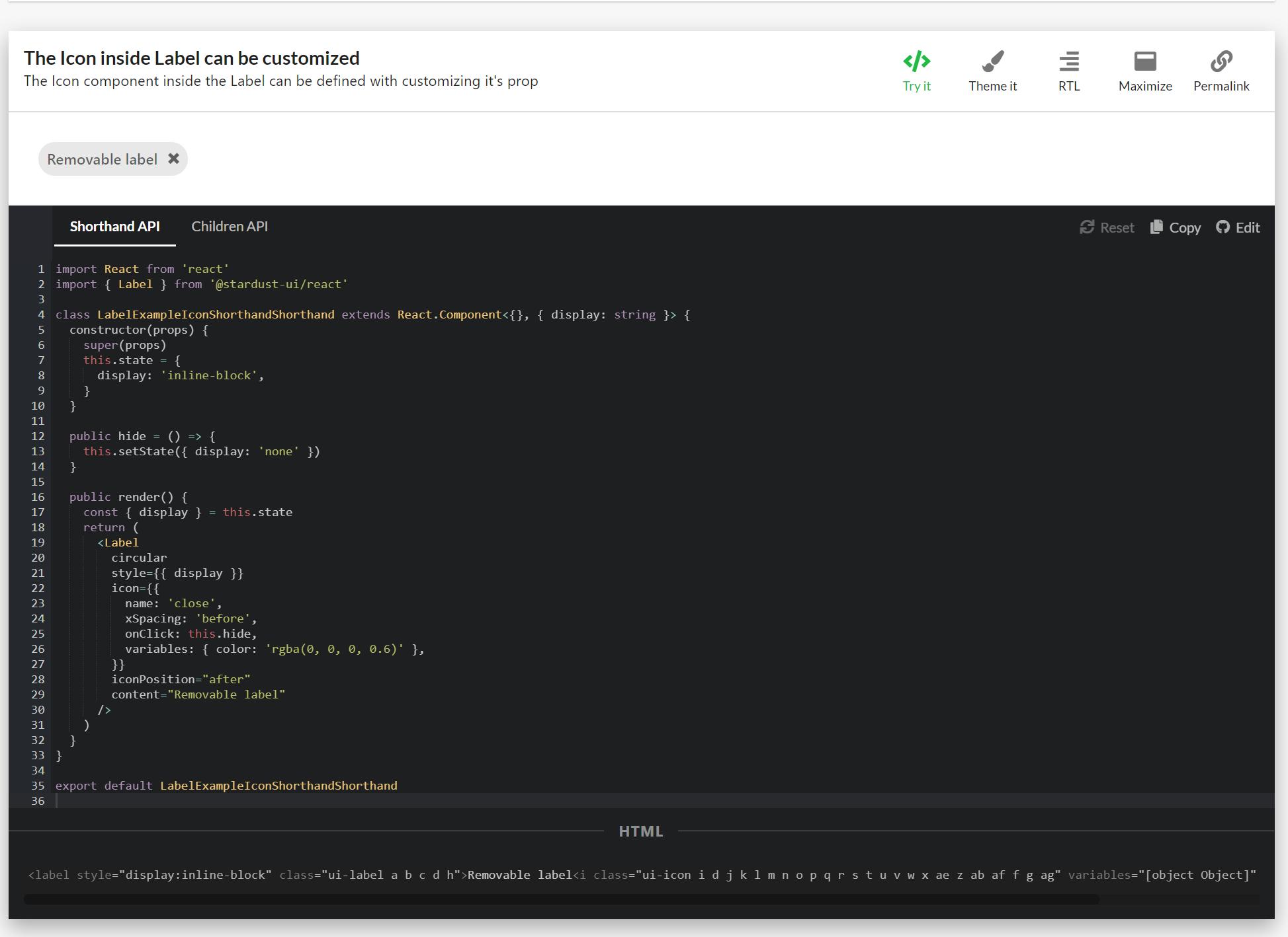
So here is how the shorthand icon example looks like now: Apart from this, we can define the properties for icon using different variables as icon, iconPosition and onIconClick, in the following way:
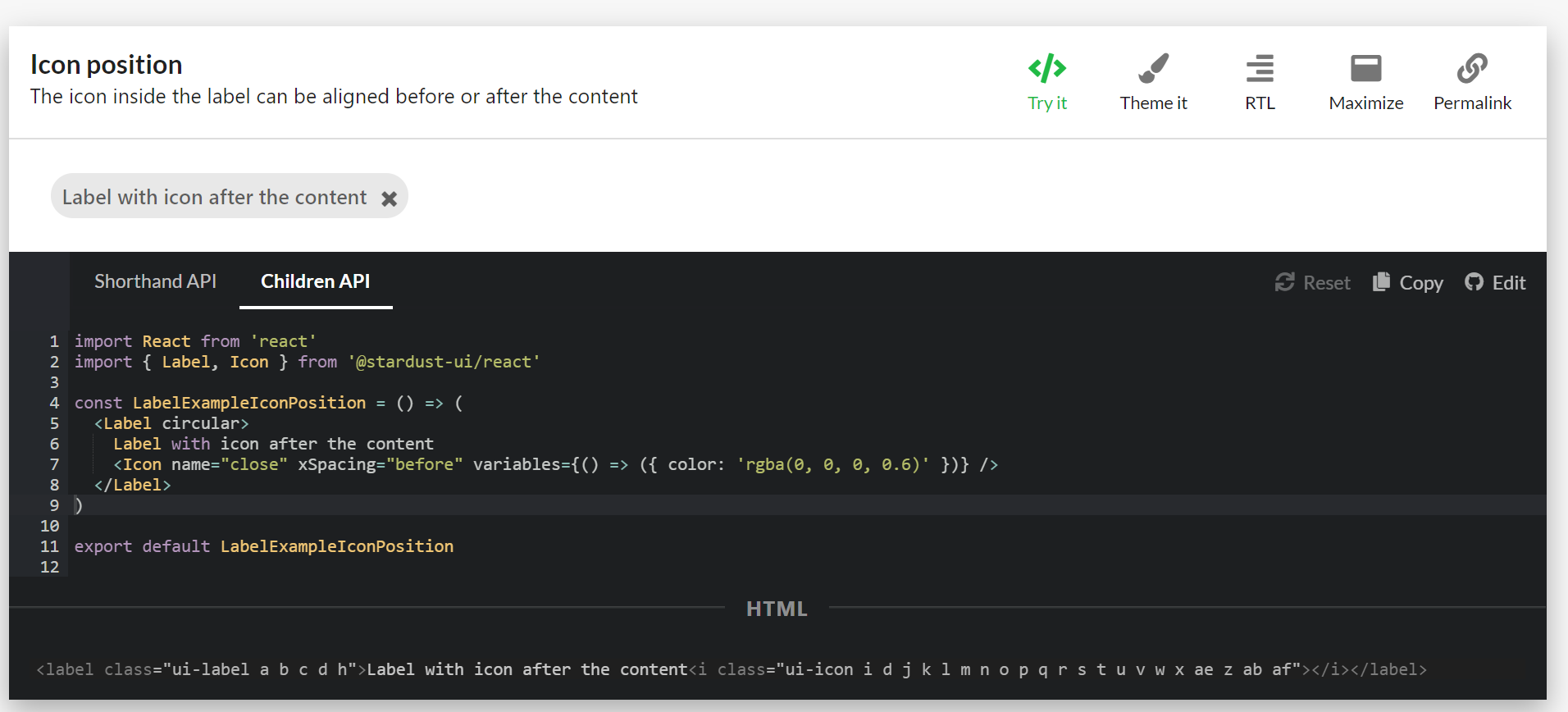
The the children API for this would look like this:
@kuzhelov please let me know if you have some other suggestion. |
 mnajdova
changed the title
mnajdova
changed the title
| onClick: this.hide, | ||
| variables: { color: 'rgba(0, 0, 0, 0.6)' }, | ||
| }} | ||
| iconPosition="after" |
There was a problem hiding this comment.
just as a matter of notice - it seems that we were using start and end as a way to declare position (for example, in Layout component). Maybe, just for the sake of consistency, we should use the same naming here as well
src/components/Label/Label.tsx
Outdated
| content: customPropTypes.contentShorthand, | ||
|
|
||
| /** Label can have an icon. */ | ||
| icon: customPropTypes.some([PropTypes.bool, PropTypes.string, PropTypes.object]), |
There was a problem hiding this comment.
a bit confused - could you, please, suggest why client would need to provide a bool value here?
There was a problem hiding this comment.
I will delete this, in the beginning I was thinking about having default value for the removable icon to be close, but it is not applicable anymore. Thanks for the catch!
src/components/Label/Label.tsx
Outdated
| icon: customPropTypes.some([PropTypes.bool, PropTypes.string, PropTypes.object]), | ||
|
|
||
| /** An icon label can format an Icon to appear before or after the text in the label */ | ||
| iconPosition: PropTypes.oneOf(['before', 'after']), |
There was a problem hiding this comment.
once again, just for the sake of consistency - maybe it would be better to use start and end keywords for that
There was a problem hiding this comment.
I will change these, and create separate PR for fixing this in the button and Icon components.
src/components/Label/Label.tsx
Outdated
| return ( | ||
| <ElementType {...rest} className={classes.root}> | ||
| {childrenExist(children) ? children : content} | ||
| {getContent()} |
There was a problem hiding this comment.
I would rather suggest to leave the logic of deciding between rendering children (if exist) or content here - in that way it would be much easier to reason about whether this functionality is provided or not. And getContent() function being responsible to properly compose content nodes in case if content is provided - without taking responsibility on deciding between children and content case:
return (
   <ElementType {...rest} className={classes.root}>
        {childrenExist(children) ? children : getContent()}
       ...
src/components/Label/Label.tsx
Outdated
| ...(icon && | ||
| typeof icon === 'string' && { | ||
| name: icon, | ||
| ...(onIconClick && { tabIndex: '0' }), |
There was a problem hiding this comment.
it seems to be an important thing - could you, please, kindly suggest what the behavior will be in case if this tabIndex line will be omitted? Thanks :)
There was a problem hiding this comment.
The aim here is, to make the icon focusable (having tabindex="0") if eather the onIconClick property is provided or if the icon shorthand provides us with the onClick method for the icon.
src/components/Label/Label.tsx
Outdated
| typeof icon === 'string' && { | ||
| name: icon, | ||
| ...(onIconClick && { tabIndex: '0' }), | ||
| variables: { color: classes.root.color }, |
There was a problem hiding this comment.
would rather suggest to use variables for this. This will make proper logical ties between these two components - specifically, that icon's color is defined by Label's color variable in this context. And, given that client of Label might be interested in customizing Label's color, we might think about exposing it as a variable (currently hardcoded value is used) - with that we will introduce a way to customize this aspect for Label, a way that is consistent with other components. Please, let me know about your thoughts on this, as well as whether it is better to do that by means of additional dedicated PR
There was a problem hiding this comment.
I agree on this, it would be much better. Just to be clear that we are on the same page: I will introduce the color for the label as a color variable inside the label variables, and provide it to the icon in the following manner:
variables: { color: Label.variables().color },
If this is the change that we both aim to, I would rather introduce it in this PR.
src/components/Label/Label.tsx
Outdated
| ...(icon && | ||
| typeof icon === 'object' && { | ||
| ...icon, | ||
| ...(icon.onClick && { tabIndex: '0' }), |
There was a problem hiding this comment.
on a client side, would rather expect that xSpacing will be defined for this case as well, in case if no value is explicitly provided by the client. Probably, it would be better to organise conditional statements in the following way, to reduce code duplication:
...(icon &&
   ...(icon.onClick || onIconClick) && { tabIndex: ... },
   ...(getIconContent(icon) ? 'none'
           : iconAtEnd ? 'before' : 'after')
...There was a problem hiding this comment.
I was not sure if we want to add some other props to the Icon if it is provided as an object, that's why I separated the definition between this two, so that it can be more clear what is applied in both cases. If we decided to apply the same styles to both cases (for the case when the icon is string always, and for the case when the icon is object and those specific are not define), then I guess the reorganizing of the conditional statements can be made. I see the point to finish styling the icon component so that it would look reasonable in the label component, but it might be confusing for the user to see the icon styled with props that he/she has not provided. In the end the only two props that are in question are the color and the xSpacing props for the icon. What is your final thought on this @kuzhelov ?
There was a problem hiding this comment.
Actually I refactored this part using the handleIconOverrides method, and I am providing the default values for the props we want to handle if those are not defined. Let me know what you think.
src/components/Label/Label.tsx
Outdated
| }, | ||
| ), | ||
| ].filter(Boolean) | ||
| return iconIsAfterContent ? renderedContent : renderedContent.reverse() |
There was a problem hiding this comment.
this (starting from line 103) is a neat trick :) but just for the sake of maintainability and readability, it may be better to consider simpler and more expressive approach to declare what will be rendered - just do the following:
renderContent() {
    ...
   const icon = renderIcon()
   const iconAtStart = !iconAtEnd

   return (
        { iconAtStart && icon }
        { content }
        { iconAtEnd && icon }
     ...
to my mind, it would require less thought of the reader to understand what is going on here and whether provided logic is correct in terms of what will be rendered.
Please, let me know what do you think and decide by yourself what would be better :)
-done some refactoring in the render method of the Label component
 kuzhelov
left a comment
kuzhelov
left a comment
kuzhelov
left a comment
There was a problem hiding this comment.
couple of notes - please, take a look. Thank you 👍
| import React from 'react' | ||
| import { Label } from '@stardust-ui/react' | ||
|
|
||
| class LabelExampleIconShorthandShorthand extends React.Component<{}, { display: string }> { |
There was a problem hiding this comment.
nit: Shorthand is used twice in the name
|
|
||
| const LabelExampleIcon = () => ( | ||
| <Label> | ||
| <Icon name="coffee" xSpacing="after" variables={() => ({ color: 'rgba(0, 0, 0, 0.6)' })} /> |
There was a problem hiding this comment.
note to myself - these keywords for xSpacing should be changed as well
There was a problem hiding this comment.
We should introduce separate PR for the Icon's xSpacing and the Button's iconPosition to be consistent with the rest of the components.
src/components/Label/Label.tsx
Outdated
| _.invoke(this.props, 'onIconClick', e, this.props) | ||
| }, | ||
| ...((onClick || onIconClick) && { tabIndex: '0' }), | ||
| ...((!variables || !variables.color) && { variables: { color: Label.variables().color } }), |
There was a problem hiding this comment.
this turns out to be quite dangerous thing, but seems that we have nothing to do with that now. Essentially, the problem is that Label's variables are evaluated with no argument - while variables fuction implies that there could be site variables provided for this evaluation.
Ideally, this function should have the following semantics:
handleIconOverrides(labelVariables) { // already evaluated
    ....
    ...(labelVariables.color && { variables: { color: labelVariables.color }})
}
while for now we will use the same expression for evaluating variables - while keeping in mind that we should find a way to provide evaluated variables at the rendering phase (i.e. as an arg to renderComponent function):
For now
renderComponent(...) {  // no evaluated variables are provided
    // TODO should be fixed
    const labelVariables = Label.variables()

    const iconElement = Icon.create({
       ...
       {
              overrideProps: this.handleOverrideProps(labelVariables)
       }

}
and when fixed:
renderComponent({ variables: labelVariables, ...}) {
    const iconElement = Icon.create({
       ...
       {
              overrideProps: this.handleOverrideProps(labelVariables)
       }

}There was a problem hiding this comment.
The overrideProps functino is invoked inside the create factory, so I don't see a way to provide the additional labelVariables from here. The only argument it gets are the predefined props. I can however fix the assumption that the variables are object inside the props of the icon shorthand with the following changes inside the handleOverrideProps like this:
  handleIconOverrides = (predefinedProps) => {
    const { onIconClick, iconPosition, content } = this.props
    const { onClick, variables, xSpacing } = predefinedProps

    // evaluate the variables inside the props (supporting variables: () => ({color: 'red'}) and variables: {color: 'red'})
    const evaluatedVariables = callable(variables)()

    return {
      onClick: e => {
        _.invoke(predefinedProps, 'onClick', e)
        _.invoke(this.props, 'onIconClick', e, this.props)
      },
      ...((onClick || onIconClick) && { tabIndex: '0' }),
      ...((!evaluatedVariables || !evaluatedVariables.color) && { variables: { color: Label.variables().color } }),
      ...(!xSpacing && {
        xSpacing: !content ? 'none' : iconPosition === 'end' ? 'before' : 'after',
      }),
    }
  }
What do you think @kuzhelov ?
There was a problem hiding this comment.
yes, that would be great - this will save us in situations when variables are provided as plain object. Would rather rename evaluatedVariables to labelVariables - it would be much easier to understand the next lines of code then. Other than that - absolutely agree, great suggestion!
There was a problem hiding this comment.
Got, it will do that. And yes, we still need a way to provide the variables together with the site variables inside the overrideProps function, we should have this is mind.
There was a problem hiding this comment.
Actually, the latest version of the method would look like this:
  handleIconOverrides = (predefinedProps) => {
    const { onIconClick, iconPosition, content, variables: labelPropVariables } = this.props
    const { onClick, variables, xSpacing } = predefinedProps

    const iconVariables = callable(variables)()
    const labelVariables = labelPropVariables ? callable(labelPropVariables)() : callable(Label.variables)()

    return {
      onClick: e => {
        _.invoke(predefinedProps, 'onClick', e)
        _.invoke(this.props, 'onIconClick', e, this.props)
      },
      ...((onClick || onIconClick) && { tabIndex: '0' }),
      ...((!iconVariables || !iconVariables.color) && { variables: { color: labelVariables.color } }),
      ...(!xSpacing && {
        xSpacing: !content ? 'none' : iconPosition === 'end' ? 'before' : 'after',
      }),
    }
  }
This way, I am handling the variables inside the label component, the default variables in the Label, as well as the variables inside the icon shorthand. This seems to work with every combination of variables provided in both components.
src/components/Label/Label.tsx
Outdated
| }, | ||
| ) | ||
|
|
||
| return [iconAtStart && icon && iconElement, content, iconAtEnd && icon && iconElement] |
There was a problem hiding this comment.
it would be a bit problematic for React to monitor changes in case if array elements are not provided with keys. I would rather suggest to use 'React.Fragment' for this scenario (where number of elements to render is rather defined)
<React.Fragment>
     { iconAtStart && icon && iconElement }
     { content }
     { iconAtEnd && icon && iconElement }
</React.Fragment>
2 participants
Label
Creating a removable variation of the Label component by introducing onRemove callback and removeIcon property.
TODO
API Proposal
onRemove
The onRemove prop is a function prop, that will be invoked when clicking on the x icon. The x icon is automatically added if this props is defined.
removeIcon
The removeIcon is shorthand prop for defining the remove icon for the label.
Edit
Thanks to @kuzhelov suggestion the following props will be introduced:
icon:
Shorthand for the icon used in the Label component. This prop can provide just the name of the icon, or object containing the props for the icon:
or
iconPosition: oneOf('before', 'after')
This property will be used to position the icon before of after the content of the Label.
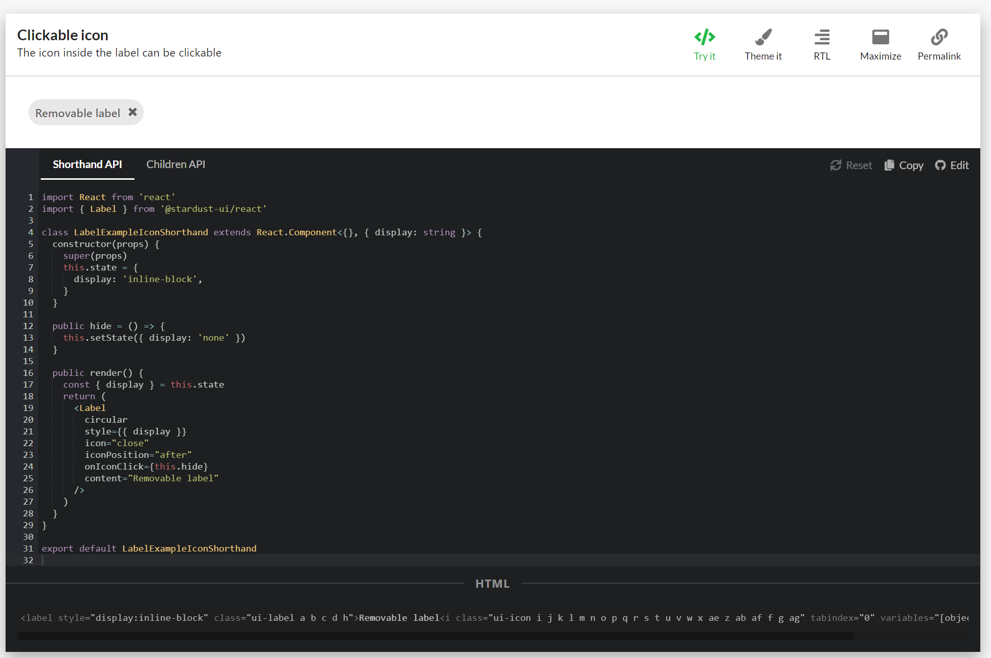
onIconClick: func
This property will be used for propagating callback when the icon is clicked. The same can be achieved if the icon prop provides onClick func:
or