feat(header-navigation): add implementation#525
Conversation
 blackswanny
force-pushed
the
feature/header
branch
from
blackswanny
force-pushed
the
feature/header
branch
from
034767e to
bbbc8e9
Compare
 gergelyke
changed the title
gergelyke
changed the title
|
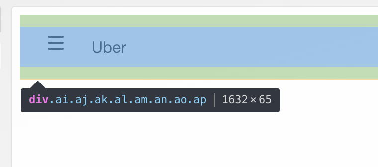
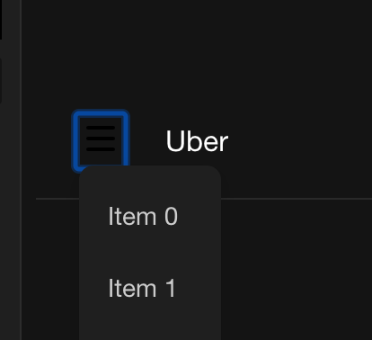
it seems like the hamburger icon is not in the middle |
 gergelyke
left a comment
gergelyke
left a comment
gergelyke
left a comment
There was a problem hiding this comment.
are you planning to add tests in a separate PR?
| /* eslint-env node */ | ||
| /* eslint-disable flowtype/require-valid-file-annotation */ | ||
| module.exports = { | ||
| WITH_MENU_ELEMENT: 'With Dropdown Menu', |
There was a problem hiding this comment.
can you please add Header navigation (or something similar) to the names, so for the visual regression tests it is simpler to include in screener.config.js?
src/header-navigation/examples.js
Outdated
| }) | ||
| } | ||
| > | ||
| <svg |
There was a problem hiding this comment.
can we move the svg to a file and import it, just to make this example more readable?
src/header-navigation/index.js
Outdated
| // Styled elements | ||
| export { | ||
| Root as StyledRoot, | ||
| NavigationItem, |
There was a problem hiding this comment.
Should we add Styled to the NavigationItem and NavigationList components for consistency?
There was a problem hiding this comment.
As per @schnerd original proposal current names look more semantically right. I can rename it if needed
There was a problem hiding this comment.
I agree with @Austin94 comment, we should be consistent. So far we export any styled component with Styled prefix. We should be consistent.
|
also, for the menu should we use |
blackswanny
force-pushed
the
feature/header
branch
from
bbbc8e9 to
8dc3fde
Compare
blackswanny
force-pushed
the
feature/header
branch
from
8dc3fde to
a9740f5
Compare
@gergelyke |
blackswanny
force-pushed
the
feature/header
branch
2 times, most recently
from
d2cffe0 to
b365be5
Compare
@gergelyke |
yes, next commit |
blackswanny
force-pushed
the
feature/header
branch
from
b365be5 to
0c50d27
Compare
|
Tab links in the example are not keyboard navigatable. Could you fix it please? |
|
|
||
| import * as React from 'react'; | ||
| import {Button} from '../button'; | ||
| import {StatefulMenu as Menu, KEY_STRINGS} from '../menu'; |
There was a problem hiding this comment.
We use menu component in the examples but the menu doesn't seem to work - never shows up in the current build.
src/header-navigation/examples.js
Outdated
| <div | ||
| tabIndex="0" | ||
| aria-label="Navigation menu" | ||
| style={{lineHeight: 'initial'}} |
There was a problem hiding this comment.
It's only single style but may still not be a good example to show how we do styling since it created an inline styles. Let's use styled for adding styles.
src/header-navigation/examples.js
Outdated
| </NavigationItem> | ||
| <NavigationItem>Uber</NavigationItem> | ||
| </NavigationList> | ||
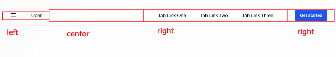
| <NavigationList $align={ALIGN.center} /> |
There was a problem hiding this comment.
What is this empty centered navigation list for?
There was a problem hiding this comment.
So in my flexbox styles if all element are left or right docked flexbox still docks them together. I had to add this center to avoid it. I checked flexbox implementation and didn't find other solution. So there has to be at least one element, that is able to flexGrow.
src/header-navigation/index.js
Outdated
| export { | ||
| Root as StyledRoot, | ||
| NavigationItem, | ||
| NavigationList, |
There was a problem hiding this comment.
I wonder if we should create container components for both NavigationItem and NavigationList that will take overrides and render StyledNavigationItem and StyledNavigationList accordingly. Since this falls outside the pattern we used in other components so far. Same as we do for the HeaderNavigation.
@schnerd what do you think about it?
There was a problem hiding this comment.
If we want to export it as a container we should add a container component to it
@nadiia fixed |
blackswanny
force-pushed
the
feature/header
branch
3 times, most recently
from
b6a4037 to
8690d87
Compare
|
Can you update the cursor to use the |
blackswanny
force-pushed
the
feature/header
branch
4 times, most recently
from
2ed4ca7 to
010c33f
Compare
|
also, can you please add the warning that says that this component is in a beta state, and may change without notice in the near future? |
blackswanny
force-pushed
the
feature/header
branch
from
f3e9472 to
0b0126d
Compare
updated for the whole header navigation |
blackswanny
force-pushed
the
feature/header
branch
2 times, most recently
from
0286047 to
96ade26
Compare
 nadiia
left a comment
nadiia
left a comment
nadiia
left a comment
There was a problem hiding this comment.
Could you address the styled components vs container components comment please?
src/header-navigation/index.js
Outdated
| // Styled elements | ||
| export { | ||
| Root as StyledRoot, | ||
| NavigationItem, |
There was a problem hiding this comment.
I agree with @Austin94 comment, we should be consistent. So far we export any styled component with Styled prefix. We should be consistent.
src/header-navigation/index.js
Outdated
| export { | ||
| Root as StyledRoot, | ||
| NavigationItem, | ||
| NavigationList, |
There was a problem hiding this comment.
If we want to export it as a container we should add a container component to it
blackswanny
force-pushed
the
feature/header
branch
2 times, most recently
from
90e1e54 to
98f4ff9
Compare
@nadiia renamed those to be styled components |
| }; | ||
| componentDidMount() { | ||
| // eslint-disable-next-line no-console | ||
| console.warn( |
There was a problem hiding this comment.
it should only warn in a DEV env
src/header-navigation/examples.js
Outdated
| <React.Fragment> | ||
| <div style={{marginTop: '50px'}} /> | ||
| <HeaderNavigation> | ||
| <NavigationList $align={ALIGN.left}> |
There was a problem hiding this comment.
Sorry, I must've missed this one on a previous look through. Why is this prop $ prefixed? It seems like there should be a container that would do the $ mapping
There was a problem hiding this comment.
this is a styled component. If we add container, it would add complexity to maintain things.
There was a problem hiding this comment.
I'm pretty torn on this. It could be confusing to users if some of the primary exports for a component require $ prefixes. On the other hand I agree creating wrappers every time we use this pattern could be annoying.
A couple ideas:
- Write an HOC that wraps styled components and maps the $ props:
import {asPrimaryExport} from '../styled/as-primary-export-hoc';

export const StyledNavigationList = styled('div', {...});

export const NavigationList = asPrimaryExport(StyledNavigationList, ['align', 'prop2', 'prop3']);
This would be far less tedious than maintaining a wrapper component for every time we use this pattern.
- Add logic to our
styledimplementation that supports similar prop mapping
export const StyledNavigationList = styled('div', {...}, {
  mapProps: ['align', 'prop2', 'prop3']
});
Internally I think this could use styletron's withWrapper? Still not 100% sure. Also adds more complexity to our styled implementation.
--
Obviously those are outside the scope of this specific PR, just trying to think of the best long term solution. Maybe short term we bite the bullet and build a container manually?
There was a problem hiding this comment.
@schnerd Thanks for the proposals! I'd +1 the #1 HOC. Also should be easy to switch to this approach if meanwile we create containers manually.
@blackswanny what do you think?
There was a problem hiding this comment.
apparently, my last comment wasn't submitted when I replied
There was a problem hiding this comment.
I applied 1) approach. Currently need to fix the test using it
blackswanny
force-pushed
the
feature/header
branch
2 times, most recently
from
af7260c to
459fc93
Compare
|
can you please use the theme variables for the hamburger icon too?
|
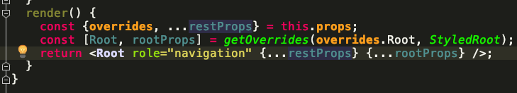
| render() { | ||
| const {overrides = {}} = this.props; | ||
| const [Root, rootProps] = getOverrides(overrides.Root, StyledRoot); | ||
| return <Root {...this.props} {...rootProps} />; |
There was a problem hiding this comment.
Should we use ...rest here so overrides isn't passed down to Root without a $ prefix?
There was a problem hiding this comment.
I think, current code fixed it
src/header-navigation/examples.js
Outdated
| <React.Fragment> | ||
| <div style={{marginTop: '50px'}} /> | ||
| <HeaderNavigation> | ||
| <NavigationList $align={ALIGN.left}> |
There was a problem hiding this comment.
I'm pretty torn on this. It could be confusing to users if some of the primary exports for a component require $ prefixes. On the other hand I agree creating wrappers every time we use this pattern could be annoying.
A couple ideas:
- Write an HOC that wraps styled components and maps the $ props:
import {asPrimaryExport} from '../styled/as-primary-export-hoc';

export const StyledNavigationList = styled('div', {...});

export const NavigationList = asPrimaryExport(StyledNavigationList, ['align', 'prop2', 'prop3']);
This would be far less tedious than maintaining a wrapper component for every time we use this pattern.
- Add logic to our
styledimplementation that supports similar prop mapping
export const StyledNavigationList = styled('div', {...}, {
  mapProps: ['align', 'prop2', 'prop3']
});
Internally I think this could use styletron's withWrapper? Still not 100% sure. Also adds more complexity to our styled implementation.
--
Obviously those are outside the scope of this specific PR, just trying to think of the best long term solution. Maybe short term we bite the bullet and build a container manually?
blackswanny
force-pushed
the
feature/header
branch
from
459fc93 to
98165d3
Compare
fixed. @gergelyke |
gergelyke
left a comment
gergelyke
left a comment
There was a problem hiding this comment.
I am an A on this once David's feedback is resolved
blackswanny
force-pushed
the
feature/header
branch
from
98165d3 to
79438de
Compare
|
Deploy preview for baseui ready! Built with commit 178c457 |
blackswanny
force-pushed
the
feature/header
branch
from
79438de to
178c457
Compare
| }, {}); | ||
| return <StyledComponent {...styledProps} />; | ||
| }; | ||
| } |
| }; | ||
| }), | ||
| ['align'], | ||
| ); |
There was a problem hiding this comment.
It might be nice to also flowtype this component since it's a primary export.
Flow, might complain that this is incompatible with return type of asPrimaryExport, but you could always cast through any to fix that.
export const NavigationList: React.ComponentType<
  {align: string, children: React.Node}
> = (asPrimaryExport( ... ): any);There was a problem hiding this comment.
fixed. I wonder why flow didn't complain about it
blackswanny
force-pushed
the
feature/header
branch
2 times, most recently
from
6d7f501 to
b7c4069
Compare
nadiia
left a comment
nadiia
left a comment
There was a problem hiding this comment.
Before merging please make sure that the Styled component wrapped in HOC behaves as a styled component in cases of restyling
blackswanny
force-pushed
the
feature/header
branch
from
b7c4069 to
ef44729
Compare
added example for that |
blackswanny
force-pushed
the
feature/header
branch
from
ef44729 to
3782e5d
Compare
6 participants
add header navigation implementation
Header navigation is highly customizable component. All examples provide different ways customers can address their design and concerns. They mainly show flexibility of Base UI rather than component itself.